


Discover legacy content from linotype.com, preserved for your reference.
Renner Antiqua
Renner Antiqua – Reviving a serif typeface from the designer of Futura

Introduction
Linotype’s Renner Antiqua™ is a revival by Patrick Strietzel of an earlier typeface issued by D. Stempel AG in metal. The original Renner Antiqua was designed by Paul Renner (1878–1956).
Paul Renner
Paul Renner was a German artist, author, teacher, and typographer. He is best known as the designer of the Futura® typeface, first released by the Bauer’sche Gießerei in 1928 and still a best seller.
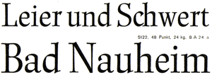
 |
| Scan of the original Renner Antiqua from a D. Stempel AG catalog |
Antiqua?
Antiqua is a term used in German to denote serif typefaces, many of them oldstyles (Garamond-Antiqua, Palatino-Antiqua, etc.). The word is used in very much the same way as “roman” in English-speaking typography to differentiate between upright and italic typefaces in a family.
Historical basis
Influenced by broad pen writing, and the designer’s own hand, Paul Renner’s original concept for this family included a regular, italic, bold, and bold condensed. However, only the regular and italic faces were put into production and sold. The roman capitals are “modern” in style, like late-18th and early 19th-century typefaces. Although this means that they have a different feeling and structure than the lowercase, they each work together well. It is this kind of variation that one expects from a master such as Renner. Even in Futura, Renner drew uppercase forms that remind of ancient Roman capitals, while the lowercase would be more geometric, and not based on historical models. In his 1998 monograph on Paul Renner, Christopher Burke writes that Renner Antiqua may even be inspired by the work of the 18th-century Dutch punchcutter Johann Michael Fleischmann.
Renner Antiqua’s italic was originally named Renner Kursiv, again not an atypical naming change for early-20th-entury German typefaces.
 |
| Scan of the original Renner Antiqua from a D. Stempel AG catalog |
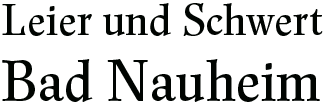 |
| The same text reset in the digital Renner Antiqua |
Released for hand-setting in 1939, Stempel adapted the design for use on the Linotype machine in 1940. Even after the end of the Second World War, some German newspapers were still using Renner Antiqua matrices. However, the release date of the typeface and Germany’s history ultimately limited the success of the design.
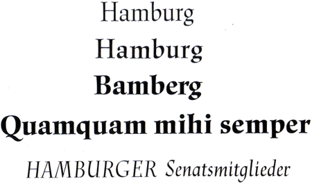 |
| Scan of a proof print with different Renner Antiqua family members from the D. Stempel AG archives |
The revived family
Today’s digital Renner Antiqua offers users two optical sizes: text and display. Renner Antiqua Display and Renner Antiqua Display Italic are optimized for large point size typesetting. The text fonts in the family (regular, italic, medium, medium italic, demi, demi italic, bold, and bold italic) are drawn to look best at 10-point size. Patrick Strietzel revival offers users more weights and styles than the original metal Renner Antiqua. Fortunately, he was also able to keep something of the optical variations typical of that time, too.
more ...