Select this license type when you are developing an app for iOS, Android, or Windows Phone, and you will be embedding the font file in your mobile application's code.
Didonesque™
by Monotype
Individual Styles from $25.99
Complete family of 16 fonts: $167.99

Didonesque Font Family was
designed by
Paulo Goode and
published by
Monotype. Didonesque contains
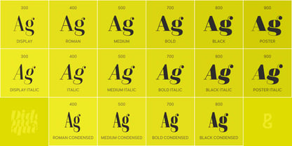
14
styles and family package options.
More about this family
- Aa Glyphs
-
Best ValueFamily Packages
- Individual Styles
- Tech Specs
- Licensing
-
Didonesque Roman
-
Didonesque Black Condensed
Per style:
$10.49
Pack of 16 styles:
$167.99
About Didonesque Font Family
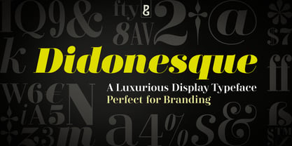
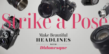
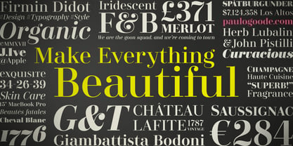
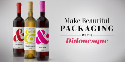
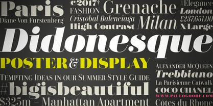
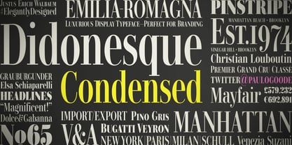
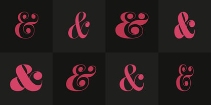
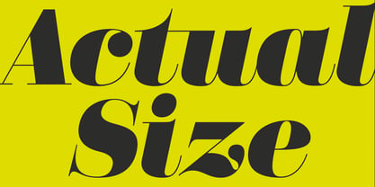
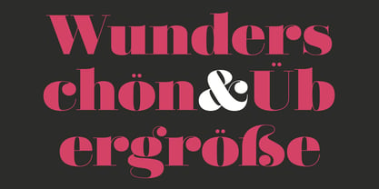
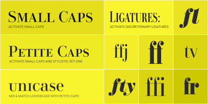
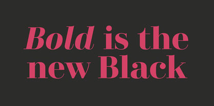
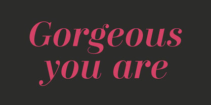
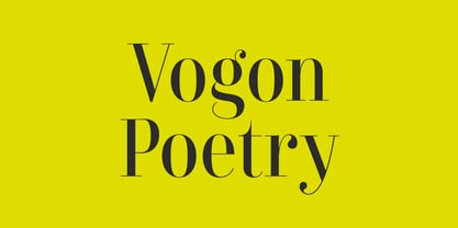
Say hello to Didonesque – inspired by classic Didone typefaces that are synonymous with luxury brands, it is a highly versatile and elegantly stylish font family. It is inherently a display typeface and therefore ideal for headlines, logotype, branding and short runs of text. See more examples at this font’s microsite – http://didonesque.com Distinguishing features include a higher x-height with shorter ascenders and descenders than traditional Didone typefaces, there are slight curvatures within the /v/w/y/ characters helping to give Didonesque a distinctive style. Also included are small caps and petite caps with full European diacritics, you can mix and match the petite caps with regular lowercase glyphs to create interesting unicase-style typography.
Key features:
• 4 weights in Roman and Italic styles • Poster & Display styles in roman and italic • 4 weights in Condensed style • Small Caps, Petite Caps, Alternates, Ligatures and Contextual Alternates • Full European character set • 750 glyphs per font.Designers: Paulo Goode
Publisher: Monotype
Foundry: Monotype
Original Foundry: Paulo Goode
Design Owner: Monotype
MyFonts debut: Jan 5, 2017
Didonesque™
is a trademark of Monotype Imaging Inc. and may be registered in certain jurisdictions.
About Monotype
The Monotype Library is one of the world’s largest and most comprehensive collection of typefaces, featuring original designs of historical importance and a fresh range of contemporary and fashionable fonts. The Monotype Library includes thousands of timeless classics, hand-crafted revivals and original designs from many of the most innovative type designers and foundries in history. This distinctive, award-winning library of premium fonts provides brands and designers with a broad and reliable selection of typefaces for expressive typography in print and on screen. The Premium Foundry page can be viewed Here.
Read more
Read less
- Choosing a selection results in a full page refresh.