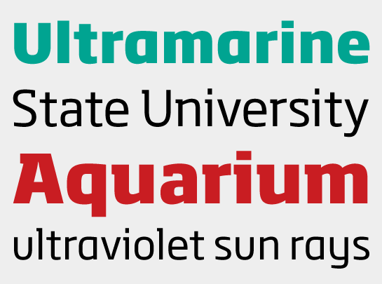
Sebastian Lester, designer of the Soho family, took care to ensure that the Soho and Soho Gothic designs are in perfect harmony. According to Lester, “The typefaces were developed alongside each other so that I could consider every aspect of each design and be certain that they would be absolutely compatible.”

A comparison of Soho (above) and Soho Gothic (below)
Designing Soho Gothic involved much more than simply removing the serifs from the earlier release, Soho. Each and every character was redrawn, resulting in a completely new design. Soho Gothic is a more understated and more subtle design than Soho. In addition, Soho Gothic is spaced and kerned as an entirely new design to ensure even typographic color at all sizes. Features that give the new design – in all its weights – its distinctive tone are the flat, crisp apexes of the diagonal characters like the ‘A’’and ‘V’, and the marked horizontal stress in the ‘a,’ ‘g’ and ‘s.’ “I wanted the family as a whole to radiate effortless modernity,“ recalls Lester, “to be a master communicator that works in all conditions and at all sizes.“ The result is a type family that will perform equally well as the backbone of a global brand as it will in an edgy fashion magazine.

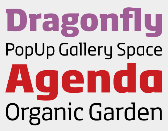
Lester also drew a collection of alternate and “semi-slab” characters to give the design added versatility. “I like to develop alternate characters for all my type designs,“ says Lester. “I believe they give graphic designers greater flexibility and make a typeface more valuable.“ Soho Gothic is available as OpenType Pro fonts that have an extended character set that supports most Central European and many Eastern European languages.
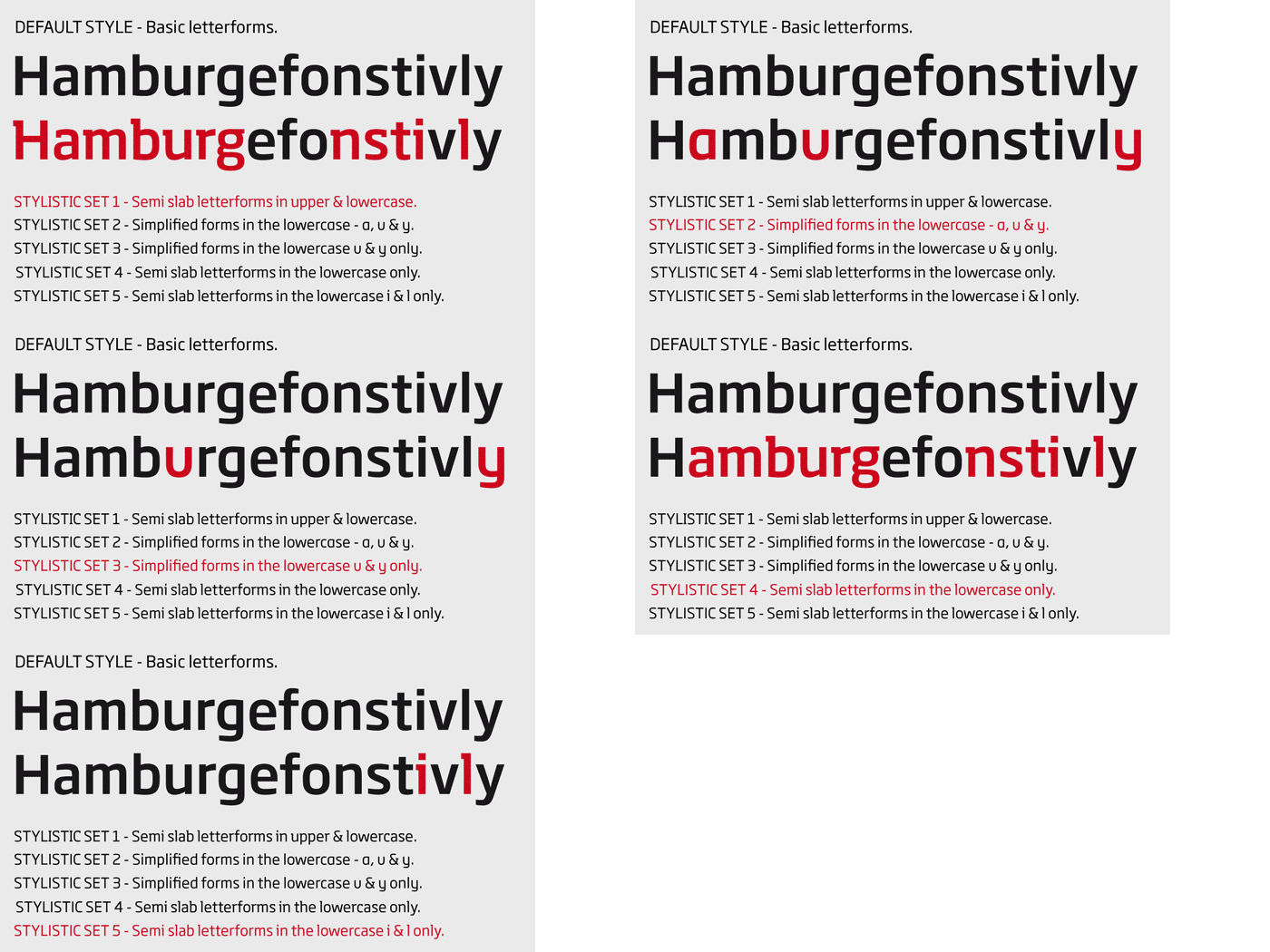
An animation to illustrate the stylistic set variations
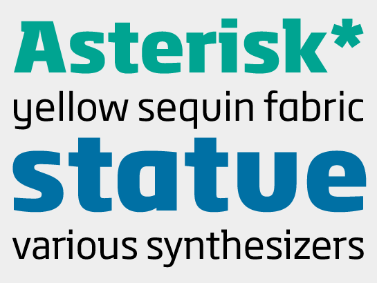
Download a special PDF specimen of Soho Gothic to see the entire character set and samples of it in use (191 kb).
 Sebastian Lester, designer of the Soho family, took care to ensure that the Soho and Soho Gothic designs are in perfect harmony. According to Lester, “The typefaces were developed alongside each other so that I could consider every aspect of each design and be certain that they would be absolutely compatible.”
 A comparison of Soho (above) and Soho Gothic (below)
Designing Soho Gothic involved much more than simply removing the serifs from the earlier release, Soho. Each and every character was redrawn, resulting in a completely new design. Soho Gothic is a more understated and more subtle design than Soho. In addition, Soho Gothic is spaced and kerned as an entirely new design to ensure even typographic color at all sizes. Features that give the new design – in all its weights – its distinctive tone are the flat, crisp apexes of the diagonal characters like the ‘A’’and ‘V’, and the marked horizontal stress in the ‘a,’ ‘g’ and ‘s.’ “I wanted the family as a whole to radiate effortless modernity,“ recalls Lester, “to be a master communicator that works in all conditions and at all sizes.“ The result is a type family that will perform equally well as the backbone of a global brand as it will in an edgy fashion magazine.

 Lester also drew a collection of alternate and “semi-slab” characters to give the design added versatility. “I like to develop alternate characters for all my type designs,“ says Lester. “I believe they give graphic designers greater flexibility and make a typeface more valuable.“ Soho Gothic is available as OpenType Pro fonts that have an extended character set that supports most Central European and many Eastern European languages.
 An animation to illustrate the stylistic set variations
 Download a special PDF specimen of Soho Gothic to see the entire character set and samples of it in use (191 kb).