Bream font family


Designed by  David Bergsland

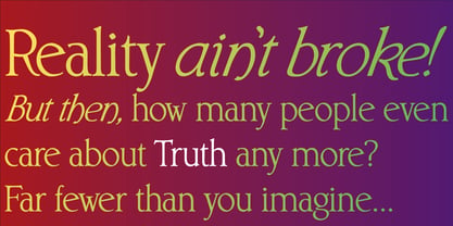
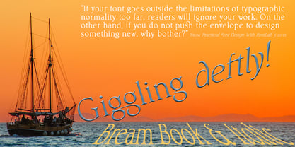
This is the display version of Librum. Librum means “book” in Latin, which I thought was appropriate. Bream is Latin for proclaim—appropriate for display work. The fonts are very close to Librum-Book and Librum-Italic, with the same OpenType features. The glyphs are modified a bit to make them a little more elegant, but that’s not very noticeable. Mainly, the letterspacing and kerning is tighter and more carefully fit to large point sizes. As for classification, I like oldstyle, Venetian, geralde, English oldstyle. There’s discrete modulation, slanted crossbars, full brackets serifs of medium thickness and sharp cut ends. For a great deal, see Librum Book Design Group, for a package containing all fifteen fonts!

Bream Italic

Desktop fonts are designed to be installed on a computer for use with applications. Licensed per user.
Pay-as-you-go web fonts are licensed for a set number of page views.
Web fonts are used with the CSS rule @font-face used. The license has no time limit.
Application licensing allows fonts to be embedded in your software applications. The license may be based on the number of titles or the number of installations.
Electronic Publication Fonts can be embedded in an eBook, eMagazine or eNewspaper. Fonts are licensed per issue.
Server fonts can be installed on a server and e.g. used by automated processes to create items. A license is per server core CPU per year.
A Digital Ads license allows you to embed web fonts in digital ads, such as ads created in HTML5. These license is based on the number of ad impressions.
Bream


Select technical format and
language support of the font.
world-map map

Std / OT TTF

supports at least

21 languages.


Technical details
OpenType outline flavour:
TTF - TrueType-Outlines
Technical font names:
File name: Bream-Italic.ttf
Windows menu name: Bream
PostScript name: , Bream-Italic
PostScript full name: , Bream-Italic
Catalog number:
168472212
Characters:
319
US$ 25
Add to cart

Features

Languages

Standard Ligatures

Tag: liga

Function: Replaces a sequence of glyphs with a single glyph which is preferred for typographic purposes. This feature covers the ligatures which the designer/manufacturer judges should be used in normal conditions. The glyph for ffl replaces the sequence of glyphs f f l.

Lining Figures

Tag: lnum

Function: This feature changes selected figures from oldstyle to the default lining form. The user invokes this feature in order to get lining figures, which fit better with all-capital text. Various characters designed to be used with figures may also be covered by this feature. In cases where lining figures are the default form, this feature would undo previous substitutions.

Old Style Figures

Tag: onum

Function: This feature changes selected figures from the default lining style to oldstyle form. The user invokes this feature to get oldstyle figures, which fit better into the flow of normal upper- and lowercase text. Various characters designed to be used with figures may also have oldstyle versions.

Proportional Figures

Tag: pnum

Function: Replaces figure glyphs set on uniform (tabular) widths with corresponding glyphs set on glyph-specific (proportional) widths. Tabular widths will generally be the default, but this cannot be safely assumed. Of course this feature would not be present in monospaced designs. The user may apply this feature to get even spacing for lining figures used as dates in an all-cap headline.

Tabular Figures

Tag: tnum

Function: Replaces figure glyphs set on proportional widths with corresponding glyphs set on uniform (tabular) widths. Tabular widths will generally be the default, but this cannot be safely assumed. Of course this feature would not be present in monospaced designs. The user may apply this feature to get oldstyle figures to align vertically in a column.

Discretionary Ligatures

Tag: dlig

Function: Replaces a sequence of glyphs with a single glyph which is preferred for typographic purposes. This feature covers those ligatures which may be used for special effect, at the user's preference. The glyph for ct replaces the sequence of glyphs c t, or U+322E (Kanji ligature for "Friday") replaces the sequence U+91D1 U+66DC U+65E5.

Slashed Zero

Tag: zero

Function: Some fonts contain both a default form of zero, and an alternative form which uses a diagonal slash through the counter. Especially in condensed designs, it can be difficult to distinguish between 0 and O (zero and capital O) in any situation where capitals and lining figures may be arbitrarily mixed. This feature allows the user to change from the default 0 to a slashed form. When setting labels, the user applies this feature to get the slashed 0.

Kerning

Tag: kern

Function: Adjusts amount of space between glyphs, generally to provide optically consistent spacing between glyphs. Although a well-designed typeface has consistent inter-glyph spacing overall, some glyph combinations require adjustment for improved legibility. Besides standard adjustment in the horizontal direction, this feature can supply size-dependent kerning data via device tables, "cross-stream" kerning in the Y text direction, and adjustment of glyph placement independent of the advance adjustment. Note that this feature may apply to runs of more than two glyphs, and would not be used in monospaced fonts. Also note that this feature does not apply to text set vertically. The o is shifted closer to the T in the combination "To."

These fonts support the Basic Latin character set. Each font is Unicode™ encoded, and available in d

Tag: Basic Latin

Function: These fonts support the Basic Latin character set. Each font is Unicode™ encoded, and available in different formats. Please review the product information for each font to ensure it will meet your requirements.