Select this license type when you are developing an app for iOS, Android, or Windows Phone, and you will be embedding the font file in your mobile application's code.
Sean Phillips
by Comicraft
Individual Styles from $39.00
Complete family of 3 fonts: $69.00

Sean Phillips Font Family was
designed by
published by
Comicraft. Sean Phillips contains
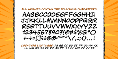
3
styles and family package options.
More about this family
- Aa Glyphs
-
Best ValueFamily Packages
- Individual Styles
- Tech Specs
- Licensing
Per style:
$23.00
Pack of 3 styles:
$69.00
About Sean Phillips Font Family
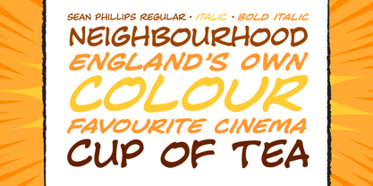
England's own Sean Phillips wanted a lettering font to suit his distinctive work with Joe Casey on WILDCATS -- and we gave it to him! Of course, the tricky bit was working on Sean's Northern accent, and making sure that every time words like color, favorite and neighborhood popped up, the letter "u" was correctly inserted. Sean's font has now undergone months of Beta testing and is now ready for release to the public. Yes, Sean Phillips, your favourite British Master of Comic Book Art is coming to a neighbourhood near you soon -- now in Full Colour!
Designers:
Publisher: Comicraft
Foundry: Comicraft
Design Owner: Comicraft
MyFonts debut: Oct 26, 2005
Sean Phillips
About Comicraft
The World's Greatest Comic Book Fonts! Having dutifully lettered thousands of comic books, Comicraft's Fearless Fonts save the day in video games, TV shows, movie titles and wherever fun, lively fonts are needed. In 1992, the Dynamic Duo of Richard Starkings and John Roshelll, and their Fearless Fleet of Font Finaglers, began providing unique design and fine lettering to the comic book, TV and video game industries, and have become known for pioneering the use of the computer in the art of comic book lettering. Trapped in a world they never made, Comicraft's Fearless Fonts will come to the rescue in the nick of time!The Premium foundry page can be viewed Here.
Read more
Read less
- Choosing a selection results in a full page refresh.