Select this license type when you are developing an app for iOS, Android, or Windows Phone, and you will be embedding the font file in your mobile application's code.
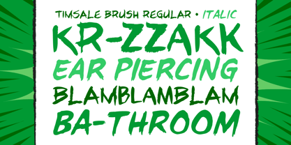
Tim Sale Brush
by Comicraft
Individual Styles from $19.00
Complete family of 2 fonts: $29.00

Tim Sale Brush Font Family was
designed by
John Roshell,
Tim Sale and
published by
Comicraft. Tim Sale Brush contains
2
styles and family package options.
More about this family
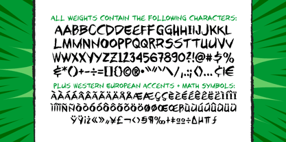
- Aa Glyphs
-
Best ValueFamily Packages
- Individual Styles
- Tech Specs
- Licensing
Per style:
$14.50
Pack of 2 styles:
$29.00
About Tim Sale Brush Font Family
These handletterered brush fonts were created by Tim Sale and fontmeister JG Roshell for our bestselling book, TIM SALE: BLACK AND WHITE!
Designers: John Roshell, Tim Sale
Publisher: Comicraft
Foundry: Comicraft
Original Foundry: unknown
Design Owner: Comicraft
MyFonts debut: Oct 26, 2005
Tim Sale Brush
About Comicraft
The World's Greatest Comic Book Fonts! Having dutifully lettered thousands of comic books, Comicraft's Fearless Fonts save the day in video games, TV shows, movie titles and wherever fun, lively fonts are needed. In 1992, the Dynamic Duo of Richard Starkings and John Roshelll, and their Fearless Fleet of Font Finaglers, began providing unique design and fine lettering to the comic book, TV and video game industries, and have become known for pioneering the use of the computer in the art of comic book lettering. Trapped in a world they never made, Comicraft's Fearless Fonts will come to the rescue in the nick of time!The Premium foundry page can be viewed Here.
Read more
Read less
- Choosing a selection results in a full page refresh.