Select this license type when you are developing an app for iOS, Android, or Windows Phone, and you will be embedding the font file in your mobile application's code.
Tim Sale
by Comicraft
Individual Styles from $39.00
Complete family of 3 fonts: $89.00

Tim Sale Font Family was
designed by
John Roshell,
Tim Sale and
published by
Comicraft. Tim Sale contains
3
styles and family package options.
More about this family
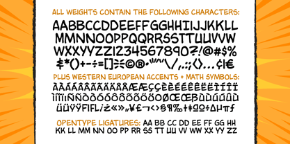
- Aa Glyphs
-
Best ValueFamily Packages
- Individual Styles
- Tech Specs
- Licensing
Per style:
$29.66
Pack of 3 styles:
$89.00
About Tim Sale Font Family
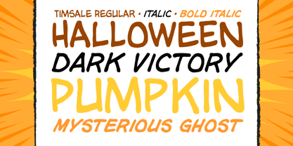
If you're familiar with the work of Eisner Award winning artist Tim Sale, you'll also be familiar with the soft curves and hard edges of the characters he brings so vividly to life in the pages of GRENDEL, BATMAN and SUPERMAN. Now you can get to know a selection of the characters Tim has been working on his whole life, and Comicraft has been kind enough to arrange them in alphabetical order for you! Based on Tim's own hand lettering work in the lost Dark Horse classic, BILLI 99, the Tim Sale font brings together the class and finesse of Hunter Rose, the elegance and charm of Bruce Wayne and the honesty and trustworthiness of Clark Kent. Don't go into the big city alone at night without it. See the families related to Tim Sale: Tim Sale Lower & Tim Sale Brush.
Designers: John Roshell, Tim Sale
Publisher: Comicraft
Foundry: Comicraft
Design Owner: Comicraft
MyFonts debut: Oct 26, 2005
Tim Sale
About Comicraft
The World's Greatest Comic Book Fonts! Having dutifully lettered thousands of comic books, Comicraft's Fearless Fonts save the day in video games, TV shows, movie titles and wherever fun, lively fonts are needed. In 1992, the Dynamic Duo of Richard Starkings and John Roshelll, and their Fearless Fleet of Font Finaglers, began providing unique design and fine lettering to the comic book, TV and video game industries, and have become known for pioneering the use of the computer in the art of comic book lettering. Trapped in a world they never made, Comicraft's Fearless Fonts will come to the rescue in the nick of time!The Premium foundry page can be viewed Here.
Read more
Read less
- Choosing a selection results in a full page refresh.