Deja Rip™ font family

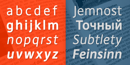
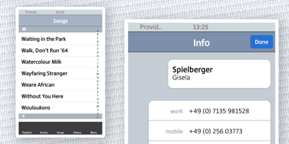
DejaRip is a contemporary, neutral, all-purpose sans-serif. It is modest and inconspicuous thanks to its basic, natural shapes; yet it lends a remarkable sense of clarity and accuracy to the overall design. DejaRip was originally designed for a mobile phone interface. Although it was eventually developed into a much more versatile family, DejaRip remains particularly readable on screen. The DejaRip family is an ideal solution for corporate design. DejaRip’s extended character set includes Unicode Latin Extended A and B, as well as full support of Cyrillic. Small caps for all languages are also included.

Deja Rip Regular

Desktop fonts are designed to be installed on a computer for use with applications. Licensed per user.
Pay-as-you-go web fonts are licensed for a set number of page views.
Web fonts are used with the CSS rule @font-face used. The license has no time limit.
Application licensing allows fonts to be embedded in your software applications. The license may be based on the number of titles or the number of installations.
Electronic Document Fonts can be embedded in an eBook, eMagazine or eNewspaper. Fonts are licensed annually per issue.
Server fonts can be installed on a server and e.g. used by automated processes to create items. A license is per server core CPU per year.
A Digital Ads license allows you to embed web fonts in digital ads, such as ads created in HTML5. These license is based on the number of ad impressions.
Deja Rip


Select technical format and
language support of the font.
world-map map

Std / OT TTF

supports at least

21 languages.


Technical details
OpenType outline flavour:
TTF - TrueType-Outlines
Technical font names:
File name: DejaRip-Regular.ttf
Windows menu name: DejaRip
PostScript name: , DejaRip
PostScript full name: , DejaRip
Catalog number:
168465554
Characters:
1195
US$ 40
Add to cart

Features

Languages

Standard Ligatures

Tag: liga

Function: Replaces a sequence of glyphs with a single glyph which is preferred for typographic purposes. This feature covers the ligatures which the designer/manufacturer judges should be used in normal conditions. The glyph for ffl replaces the sequence of glyphs f f l.

Proportional Figures

Tag: pnum

Function: Replaces figure glyphs set on uniform (tabular) widths with corresponding glyphs set on glyph-specific (proportional) widths. Tabular widths will generally be the default, but this cannot be safely assumed. Of course this feature would not be present in monospaced designs. The user may apply this feature to get even spacing for lining figures used as dates in an all-cap headline.

Superscript

Tag: sups

Function: Replaces lining or oldstyle figures with superior figures (primarily for footnote indication), and replaces lowercase letters with superior letters (primarily for abbreviated French titles). The application can use this feature to automatically access the superior figures (more legible than scaled figures) for footnotes, or the user can apply it to Mssr to get the classic form.

Tabular Figures

Tag: tnum

Function: Replaces figure glyphs set on proportional widths with corresponding glyphs set on uniform (tabular) widths. Tabular widths will generally be the default, but this cannot be safely assumed. Of course this feature would not be present in monospaced designs. The user may apply this feature to get oldstyle figures to align vertically in a column.

Small Capitals From Capitals

Tag: c2sc

Function: Small Capitals From Capitals

Small Capitals

Tag: smcp

Function: This feature turns lowercase characters into small capitals. This corresponds to the common SC font layout. It is generally used for display lines set in Large & small caps, such as titles. Forms related to small capitals, such as oldstyle figures, may be included. The user enters text as mixed capitals and lowercase, and gets Large & small cap text.

Sylistic Set 1

Tag: ss01

Function: In addition to, or instead of, stylistic alternatives of individual glyphs (see 'salt' feature), some fonts may contain sets of stylistic variant glyphs corresponding to portions of the character set, e.g. multiple variants for lowercase letters in a Latin font. Glyphs in stylistic sets may be designed to harmonise visually, interract in particular ways, or otherwise work together. Examples of fonts including stylistic sets are Zapfino Linotype and Adobe's Poetica. Individual features numbered sequentially with the tag name convention 'ss01' 'ss02' 'ss03' . 'ss20' provide a mechanism for glyphs in these sets to be associated via GSUB lookup indexes to default forms and to each other, and for users to select from available stylistic sets.

Sylistic Set 2

Tag: ss02

Function: In addition to, or instead of, stylistic alternatives of individual glyphs (see 'salt' feature), some fonts may contain sets of stylistic variant glyphs corresponding to portions of the character set, e.g. multiple variants for lowercase letters in a Latin font. Glyphs in stylistic sets may be designed to harmonise visually, interract in particular ways, or otherwise work together. Examples of fonts including stylistic sets are Zapfino Linotype and Adobe's Poetica. Individual features numbered sequentially with the tag name convention 'ss01' 'ss02' 'ss03' . 'ss20' provide a mechanism for glyphs in these sets to be associated via GSUB lookup indexes to default forms and to each other, and for users to select from available stylistic sets.

Sylistic Set 3

Tag: ss03

Function: In addition to, or instead of, stylistic alternatives of individual glyphs (see 'salt' feature), some fonts may contain sets of stylistic variant glyphs corresponding to portions of the character set, e.g. multiple variants for lowercase letters in a Latin font. Glyphs in stylistic sets may be designed to harmonise visually, interract in particular ways, or otherwise work together. Examples of fonts including stylistic sets are Zapfino Linotype and Adobe's Poetica. Individual features numbered sequentially with the tag name convention 'ss01' 'ss02' 'ss03' . 'ss20' provide a mechanism for glyphs in these sets to be associated via GSUB lookup indexes to default forms and to each other, and for users to select from available stylistic sets.

Capital Spacing

Tag: cpsp

Function: Globally adjusts inter-glyph spacing for all-capital text. Most typefaces contain capitals and lowercase characters, and the capitals are positioned to work with the lowercase. When capitals are used for words, they need more space between them for legibility and esthetics. This feature would not apply to monospaced designs. Of course the user may want to override this behavior in order to do more pronounced letterspacing for esthetic reasons. The user sets a title in all caps, and the Capital Spacing feature opens the spacing.

These fonts support the Basic Latin character set. Each font is Unicode™ encoded, and available in d

Tag: Basic Latin

Function: These fonts support the Basic Latin character set. Each font is Unicode™ encoded, and available in different formats. Please review the product information for each font to ensure it will meet your requirements.