Select this license type when you are developing an app for iOS, Android, or Windows Phone, and you will be embedding the font file in your mobile application's code.
Noyh
by Typesketchbook
Individual Styles from $55.00
30% Off
Complete family of 72 fonts: $160.00


Noyh Font Family was
designed by
Chatnarong Jingsuphatada and
published by
Typesketchbook. Noyh contains
72
styles and family package options.
More about this family
- Aa Glyphs
-
Best ValueFamily Packages
- Individual Styles
- Tech Specs
- Licensing
About Noyh Font Family
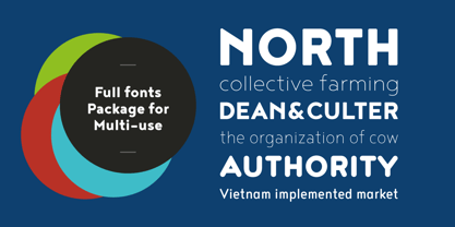
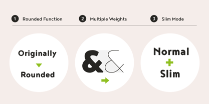
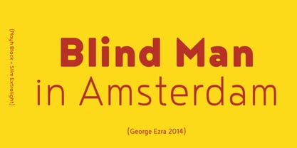
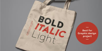
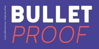
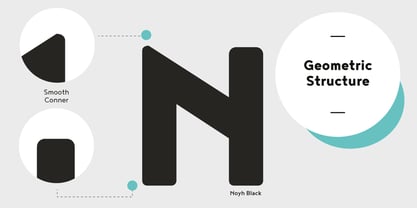
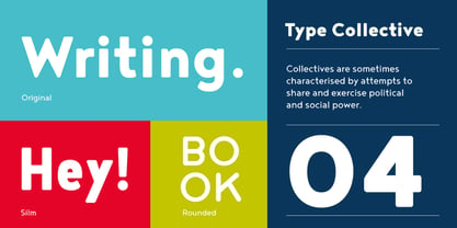
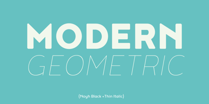
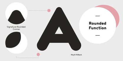
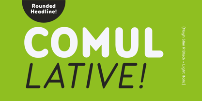
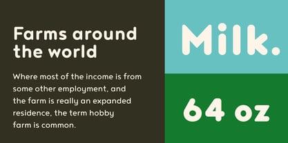
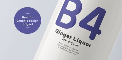
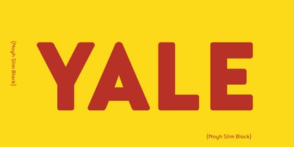
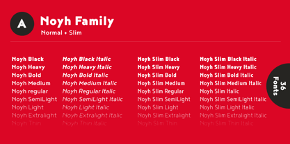
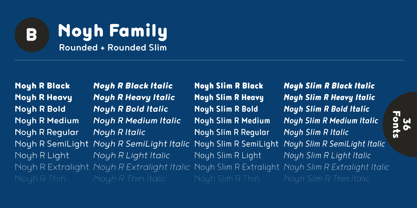
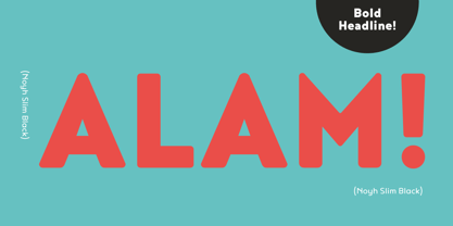
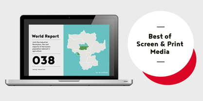
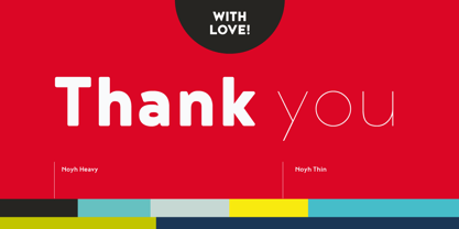
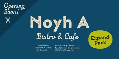
Noyh is a modern geometric font family that is based on research of similar typefaces of the 1990s and 2000s. Based on that research, font designer Chatnarong Jingsuphatada created a design whose main purpose is to perform equally well in as many environments as possible. Noyh offers a geometric structure with smooth corners, giving it great legibility and making it clean and friendly. As a result, Noyh works well both in print and on screen; it can be used freely for e-books and mobile applications and is perfect for headlines, banners, posters, web-sites, magazines, etc. Perhaps the greatest advantage of Noyh is the stunning number of fonts it includes. There are no less than 72 fonts, each containing over 350 glyphs. The family has 4 formats – Normal, Rounded, Slim and Slim Rounded. Each format is supplied in 9 weights – from Hairline to Black with their respective italics. The individual fonts work very harmoniously with one another, giving the potential user a variety of options. The Noyh font family was created by Thai designer Chatnarong Jingsuphatada and is released by the Typesketchbook type foundry. Chatnarong intends to add an additional member to the family – Noyh A – that will include ornaments, undoubtedly making the Noyh family even more versatile and multi-functional. In the meantime, please take a look at his other typographical projects: Delm, Mairy, Tolyer, Abula.
Designers: Chatnarong Jingsuphatada
Publisher: Typesketchbook
Foundry: Typesketchbook
Design Owner: Typesketchbook
MyFonts debut: Aug 10, 2015
Noyh
About Typesketchbook
Located in the capital city of Thailand, Chatnarong Jingsuphatada started his type design career while working as a graphic designer. Throughout his career, whenever he was unable to find exactly what he needed for his own design projects, he began to create new typefaces rather than settle for ones that didn’t quite fit. He experimented with different designs for 2 years before launching his Superstore Font Foundry, and then in 2012, began selling his typefaces on MyFonts. He made his debut that year with Gusto, a font that explores the intersection of san serif and humanist styles. Finding a strength in his ability to combine different styles of fonts into one, he went on to create Quan, which consists of a very usable, clean and modern sans typeface and a more rounded sub-family.
Read more
Read less
- Choosing a selection results in a full page refresh.