Revista font family


Designed by  Daniel Hernández
Paula Nazal Selaive
Marcelo Quiroz

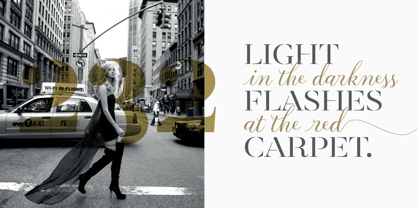
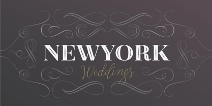
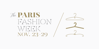
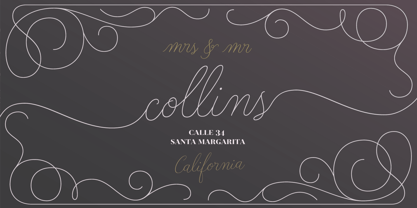
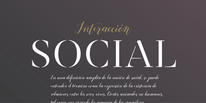
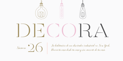
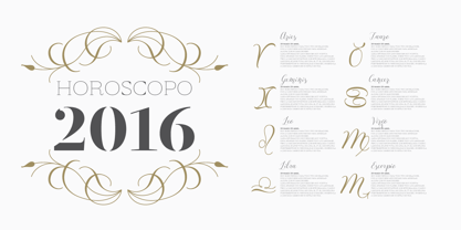
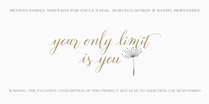
Revista is a typographic system that brings together all the features to undertake any fashion magazine-oriented project. The font harmoniously blends different styles into a single big family, which consists of a Didone uppercase and small caps family—including 4 variants ranging from a monolinear Thin to Black with matching italics—and an Inline Black variant that works as a decorative alternative to the Didone fonts. Revista Stencil, one of its versions, comes with the same number of variants. Revista also comes with a Script Family that includes 5 weights, ranging from Thin (monolinear) to Black, contrasting in a tidily untidy way with many ligatures and alternates. You can choose between using stylistic alternates—if you want to give your designs a different untidy look, in the style of the modern calligraphy—or switching between different options if you are looking for a hand-written style. We highly recommend using the default contextual alternates and discretionary ligatures in order to take more advantage of this great font family. Revista includes 2 sets of dingbats, varying from zodiac signs symbols to technology symbols, and complementary ornaments in 3 different weights: Thin (monolinear), Regular and Black. All these features make Revista an ideal typeface for users to design to their liking! Photo by Fervent-adepte-de-la-mode

Revista Stencil

Desktop fonts are designed to be installed on a computer for use with applications. Licensed per user.
Pay-as-you-go web fonts are licensed for a set number of page views.
Web fonts are used with the CSS rule @font-face used. The license has no time limit.
Application licensing allows fonts to be embedded in your software applications. The license may be based on the number of titles or the number of installations.
Electronic Document Fonts can be embedded in an eBook, eMagazine or eNewspaper. Fonts are licensed annually per issue.
Server fonts can be installed on a server and e.g. used by automated processes to create items. A license is per server core CPU per year.
A Digital Ads license allows you to embed web fonts in digital ads, such as ads created in HTML5. These license is based on the number of ad impressions.
Revista


Select technical format and
language support of the font.
world-map map

Std / OT CFF

supports at least

21 languages.


Technical details
OpenType outline flavour:
CFF - PostScript-Outlines
Technical font names:
File name: RevistaStencil-Regular.otf
Windows menu name: Revista Stencil
PostScript name: , RevistaStencil-Regular
PostScript full name: , Revista Stencil
Catalog number:
167463097
Characters:
373
US$ 29
Add to cart

Features

Languages

Case-Sensitive Forms

Tag: case

Function: Shifts various punctuation marks up to a position that works better with all-capital sequences or sets of lining figures; also changes oldstyle figures to lining figures. By default, glyphs in a text face are designed to work with lowercase characters. Some characters should be shifted vertically to fit the higher visual center of all-capital or lining text. Also, lining figures are the same height (or close to it) as capitals, and fit much better with all-capital text. The user selects a block of text and applies this feature. The dashes, bracketing characters, guillemet quotes and the like shift up to match the capitals, and oldstyle figures change to lining figures.

Fractions

Tag: frac

Function: Replaces figures separated by a slash with 'common' (diagonal) fractions. The user enters 3/4 in a recipe and gets the threequarters fraction.

Standard Ligatures

Tag: liga

Function: Replaces a sequence of glyphs with a single glyph which is preferred for typographic purposes. This feature covers the ligatures which the designer/manufacturer judges should be used in normal conditions. The glyph for ffl replaces the sequence of glyphs f f l.

Lining Figures

Tag: lnum

Function: This feature changes selected figures from oldstyle to the default lining form. The user invokes this feature in order to get lining figures, which fit better with all-capital text. Various characters designed to be used with figures may also be covered by this feature. In cases where lining figures are the default form, this feature would undo previous substitutions.

Localized Forms

Tag: locl

Function: Many scripts used to write multiple languages over wide geographical areas have developed localized variant forms of specific letters, which are used by individual literary communities. For example, a number of letters in the Bulgarian and Serbian alphabets have forms distinct from their Russian counterparts and from each other. In some cases the localized form differs only subtly from the script 'norm', in others the forms are radically distinct. This feature enables localized forms of glyphs to be substituted for default forms. The user applies this feature to text to enable localized Bulgarian forms of Cyrillic letters; alternatively, the feature might enable localized Russian forms in a Bulgarian manufactured font in which the Bulgarian forms are the default characters.

Old Style Figures

Tag: onum

Function: This feature changes selected figures from the default lining style to oldstyle form. The user invokes this feature to get oldstyle figures, which fit better into the flow of normal upper- and lowercase text. Various characters designed to be used with figures may also have oldstyle versions.

Ordinals

Tag: ordn

Function: Replaces default alphabetic glyphs with the corresponding ordinal forms for use after figures. One exception to the follows-a-figure rule is the numero character (U+2116), which is actually a ligature substitution, but is best accessed through this feature. The user applies this feature to turn 2.o into 2.o (abbreviation for secundo).

Capital Spacing

Tag: cpsp

Function: Globally adjusts inter-glyph spacing for all-capital text. Most typefaces contain capitals and lowercase characters, and the capitals are positioned to work with the lowercase. When capitals are used for words, they need more space between them for legibility and esthetics. This feature would not apply to monospaced designs. Of course the user may want to override this behavior in order to do more pronounced letterspacing for esthetic reasons. The user sets a title in all caps, and the Capital Spacing feature opens the spacing.

Kerning

Tag: kern

Function: Adjusts amount of space between glyphs, generally to provide optically consistent spacing between glyphs. Although a well-designed typeface has consistent inter-glyph spacing overall, some glyph combinations require adjustment for improved legibility. Besides standard adjustment in the horizontal direction, this feature can supply size-dependent kerning data via device tables, "cross-stream" kerning in the Y text direction, and adjustment of glyph placement independent of the advance adjustment. Note that this feature may apply to runs of more than two glyphs, and would not be used in monospaced fonts. Also note that this feature does not apply to text set vertically. The o is shifted closer to the T in the combination "To."

These fonts support the Basic Latin character set. Each font is Unicode™ encoded, and available in d

Tag: Basic Latin

Function: These fonts support the Basic Latin character set. Each font is Unicode™ encoded, and available in different formats. Please review the product information for each font to ensure it will meet your requirements.