Select this license type when you are developing an app for iOS, Android, or Windows Phone, and you will be embedding the font file in your mobile application's code.
Neo Sans®
by Monotype
Individual Styles from $34.99
Complete family of 12 fonts: $461.99

Neo Sans Font Family was
designed by
Sebastian Lester and
published by
Monotype. Neo Sans contains
12
styles and family package options.
More about this family
- Aa Glyphs
-
Best ValueFamily Packages
- Individual Styles
- Tech Specs
- Licensing
About Neo Sans Font Family
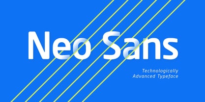
Designer Sebastian Lester describes his Neo Sans type collection as “legible without being neutral, nuanced without being fussy, and expressive without being distracting.” Featuring rounded, square sans letterforms, the Neo Sans family is available in six weights, ranging from light to ultra, with companion italics. Its forward-looking personality makes it an excellent choice for branding projects, as well as for editorial or publication design. Pair the Neo Sans collection with a serif design for interesting typographic contrast; for more direct continuity, consider the typeface's sister design—the Neo Tech family also from Lester, available in six weights with matching italics.
Designers: Sebastian Lester
Publisher: Monotype
Foundry: Monotype
Design Owner: Monotype
MyFonts debut: Oct 13, 2005
Neo Sans®
is a trademark of Monotype Imaging Inc. registered in the U.S. Patent and Trademark Office and may be registered in certain other jurisdictions.
About Monotype
The Monotype Library is one of the world’s largest and most comprehensive collection of typefaces, featuring original designs of historical importance and a fresh range of contemporary and fashionable fonts. The Monotype Library includes thousands of timeless classics, hand-crafted revivals and original designs from many of the most innovative type designers and foundries in history. This distinctive, award-winning library of premium fonts provides brands and designers with a broad and reliable selection of typefaces for expressive typography in print and on screen. The Premium Foundry page can be viewed Here.
Read more
Read less
- Choosing a selection results in a full page refresh.