Sélectionnez ce type de licence lorsque vous développez une application pour iOS, Android ou Windows Phone et que vous intégrez le fichier de fonte dans le code de votre application mobile.
Delish Pro
par Fontforecast
Styles individuels à partir de $10.00
Famille complète de 7 polices: $49.00


Delish Pro Font la famille était
conçu par
Hanneke Classen et
publié par
Fontforecast. Delish Pro contient
7
styles et des offres familiales.
En savoir plus sur cette famille
- AaGlyphs
-
Meilleure offreOffres familiales
- Styles individuels
- Spécifications techniques
- Licences
Par style :
$7.00
Paquet de 7 styles :
$49.00
À propos de Delish Pro Police Family
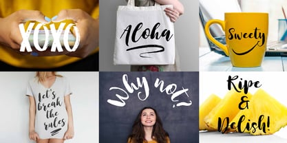
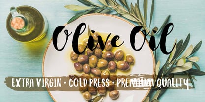
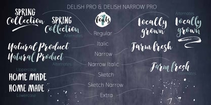
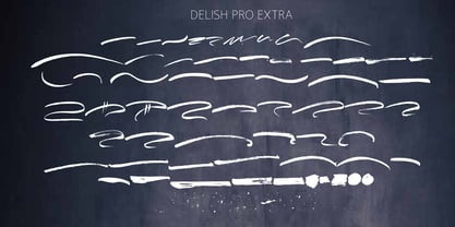
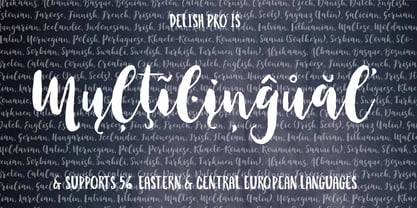
Delish Pro est une famille de brosses rebondissantes police . Lettrage à la main avec beaucoup de caractère. Cette délicieuse famille contient 7 polices dans différents styles, spécialement conçus pour s'assurer qu'il y en ait toujours un qui corresponde à vos besoins en matière de design. Il existe une version Upright et une version Italic, toutes deux dans une édition condensée, parfaite si vous recherchez une utilisation plus efficace de l'espace. Les caractères alternatifs et les ligatures de lettres doubles vous permettent d'affiner votre dessin comme vous le souhaitez. Pour compléter la gamme, Delish Pro Sketch et Delish Narrow Pro Sketch ont été ajoutés. Un Caps robuste police avec un effet de marqueur à sec. Pour rendre cette famille encore plus flexible, 64 swashes et éclaboussures d'encre sont inclus. Bonne lecture !
Concepteurs : Hanneke Classen
Éditeur : Fontforecast
Fonderie : Fontforecast
Maître d'ouvrage : Fontforecast
MyFonts débout : 14 mars 2017
Delish Pro
À propos Fontforecast
Hanneke Classen started Fontforecast in 2013 as a label of Storm Creative Consultancy, an advertising agency where she works to this day as a graphic and type designer. “Working with fonts as a designer day in, day out made me curious about the process of designing fonts,” she says. “As soon as I dived into the ins and outs of font design, I was hooked.” It was in that same year that she finished work on her first two font families: Tyfoon Sans and Tyfoon Script. “The concept was to combine two very different designs in such a way that they work together well. By using the same measurements as a skeleton for both font families they became interchangeable, even in the same sentence, without causing leading problems.” “The concept of making font families consisting of different designs especially made to complement and support each other was relatively new at the time Fontforecast started,” Hanneke says. “My aim is to give all of my font families a certain something extra.” This drive to push the envelope gave way to bestselling typefaces Chameleon, a design kit of 16 fonts intended to bring a personalized touch to any project, and Salt & Spices Pro, a modern collection of 9 calligraphy fonts that brings to life an authentic feel of vintage dip pen calligraphy. There is much to look forward to in the future from the Netherland-based foundry. Marloes Versluys, an Amsterdam-based art director, graphic designer and type designer, is joining the foundry and working with Hanneke to continue making a wide variety of typefaces perfect for any, and all projects.
En savoir plus
Lire moins