Sélectionnez ce type de licence lorsque vous développez une application pour iOS, Android ou Windows Phone et que vous intégrez le fichier de fonte dans le code de votre application mobile.
Professor™
par Three Islands Press
Styles individuels à partir de $39.00

Professor Font la famille était
conçu par
Brian Willson et
publié par
Three Islands Press. Professor contient
1
styles.
En savoir plus sur cette famille
À propos de la famille du professeur Police
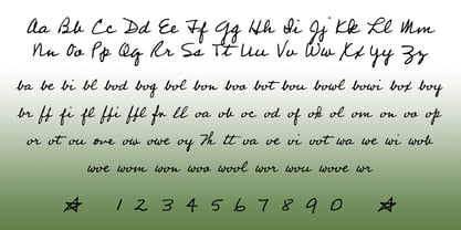
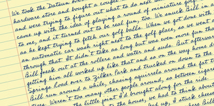
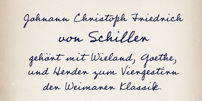
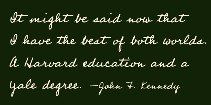
Mon père a pris sa retraite après une brillante carrière de professeur à l'université du Texas (et dans d'autres établissements). Il a également cessé d'écrire à la main, depuis que j'ai numérisé son écriture il y a plusieurs années. Professor est une version légèrement modifiée de la main cursive de mon vieux père - une main bonne, forte, serviable, amicale, sympathique, à l'image de l'homme. Utilisez Professeur pour toutes vos écritures occasionnelles : mon père n'y voit pas d'inconvénient. Disponible en un seul style de poids moyen.
Concepteurs : Brian Willson
Éditeur : Three Islands Press
Fonderie : Three Islands Press
Maître d'ouvrage : Three Islands Press
MyFonts débout : 29 juin 2006
Professor™
est une marque déposée de Three Islands Press.

À propos Three Islands Press
Three Islands Press (alias "3IP") est une petite fonderie de caractères située à Rockport, dans le Maine. Elle est spécialisée dans les reproductions historiques, les caractères textuels de qualité, les cartes anciennes ( polices) et les recréations minutieuses d'écritures anciennes et modernes. 3IP est le d.b.a. de Brian Willson, qui s'est lancé par hasard dans la création de caractères dans les années 1990, après une carrière dans le journalisme écrit et audiovisuel. Il n'a aucune formation formelle, mais un don particulier pour créer des polices qui ressemblent à de vraies écritures et à des textes anciens. 3IP représente également le travail du créateur de caractères suédois Lars Bergquist, dont la carrière précédente consistait à publier des encyclopédies et des ouvrages de référence à l'époque des caractères en plomb. Les caractères élégants, variés et polyvalents de Bergquist sont aussi raffinés que les autres.
En savoir plus
Lire moins