Sélectionnez ce type de licence lorsque vous développez une application pour iOS, Android ou Windows Phone et que vous intégrez le fichier de fonte dans le code de votre application mobile.
Zemestro™
par Monotype
Styles individuels à partir de $29.99
Famille complète de 6 polices: $442.99

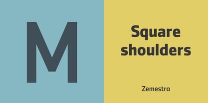

Zemestro Font la famille était
conçu par
Dave Farey et
publié par
Monotype. Zemestro contient
6
styles et des offres familiales.
En savoir plus sur cette famille
- AaGlyphs
-
Meilleure offreOffres familiales
- Styles individuels
- Spécifications techniques
- Licences
Par style :
$73.83
Paquet de 6 styles :
$442.99
Zemestro Complete Family Pack
6 policesPar style :
$61.66
Paquet de 6 styles :
$369.99
Zemestro Complete Family Pack
6 policesPar style :
$56.33
Paquet de 6 styles :
$337.99
À propos de la famille Zemestro Police
Zemestro, qui date de 2003, a été l'une des premières nouvelles "sans-serifs carrés". Son concepteur, David Farey, déclare : "Il n'y a rien de calligraphique là-dedans, et il n'y a pas de caractères uniques définissants ou identifiables - c'est juste une construction propre et simple".
Concepteurs : Dave Farey
Éditeur : Monotype
Fonderie : Monotype
Maître d'ouvrage : Monotype
MyFonts débout : 13 octobre 2005
Zemestro™
est une marque déposée de Monotype Imaging Inc. et peut être enregistrée dans certaines juridictions.
À propos Monotype
La bibliothèque de Monotype est l'une des collections de caractères les plus vastes et les plus complètes au monde. Elle comprend des dessins originaux d'importance historique et une nouvelle gamme de caractères contemporains et à la mode : polices. La bibliothèque de Monotype comprend des milliers de classiques intemporels, des reprises artisanales et des dessins originaux provenant des créateurs de caractères et des fonderies les plus innovants de l'histoire. Cette bibliothèque distinctive et primée de polices offre aux marques et aux concepteurs une sélection large et fiable de caractères pour une typographie expressive à l'impression et à l'écran. La page Premium Foundry peut être consultée ici.
En savoir plus
Lire moins