Sélectionnez ce type de licence lorsque vous développez une application pour iOS, Android ou Windows Phone et que vous intégrez le fichier de fonte dans le code de votre application mobile.
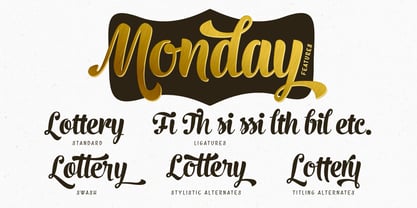
Monday™
par Fenotype
Styles individuels à partir de $20.00
Famille complète de 3 polices: $50.00


Monday Font la famille était
conçu par
Emil Karl Bertell et
publié par
Fenotype. Monday contient
3
styles et des offres familiales.
En savoir plus sur cette famille
- AaGlyphs
-
Meilleure offreOffres familiales
- Styles individuels
- Spécifications techniques
- Licences
Par style :
$16.66
Paquet de 3 styles :
$50.00
A propos de Monday Police Family
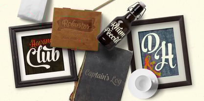
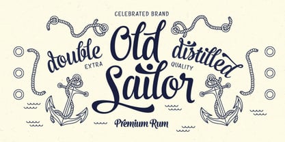
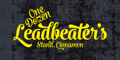
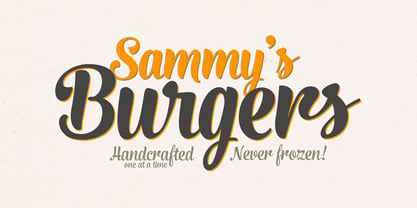
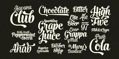
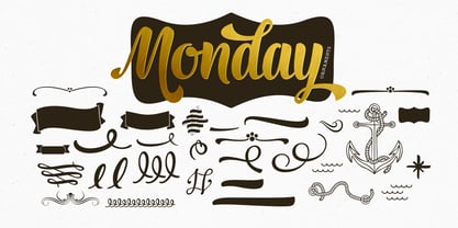
Monday est une famille de caractères audacieux et forts, composée de deux graisses et d'un jeu d'ornements assorti. Monday a l'aspect d'un lettrage manuel des années 1950 et est idéal pour les logos, les emballages et la conception de marques. Monday est équipé d'un grand nombre d'alternatives et de fonctionnalités : Pour activer les caractères alternatifs, cliquez sur Swash, Contextual, Stylistic ou Titling Alternates ou Lining Figures dans n'importe quel programme OpenType Savvy ou choisissez manuellement parmi d'autres caractères alternatifs dans la Glyph Palette. Si vous avez besoin d'écrire en majuscules, Monday se marie bien avec Peaches and Cream Caps. Monday est librement basé sur la version précédente de Fenotypes No. Seven. Pour obtenir le meilleur prix, achetez la famille Monday complète.
Concepteurs : Emil Karl Bertell
Éditeur : Fenotype
Fonderie : Fenotype
Maître d'ouvrage : Fenotype
MyFonts débout : 3 février 2015
Monday™
est une marque déposée de Fenotype Typefaces.
À propos Fenotype
Emil Bertell has done it all. Having published his first font files at 16, he was considered to be an international free-font hero while still in his teens. He went on to attend design college, drop out, and become a well-known graphic designer and illustrator. Now one of the most successful type designers from the Nordic countries on MyFonts, the Finland-based designer said in his Creative Characters interview that he’s “had an obsession with visual culture from the beginning.” Before turning his attention to type design full-time, Emil had a very successful career as an award-winning illustrator. “Illustration became my main livelihood,” he said. “I drew painstaking pencil illustrations for magazines, advertising, stamps, etc. I often designed my own fonts for festivals and hand-drew the lettering posters; I also did a few pencil illustrations based on lettershapes, and that got out of hand, so I had to do a lot more of them.” In 2012 he finally made the switch and committed all of his time to type design. Emil first saw success with his Billboard typeface. “It became my first Rising Star on MyFonts and made me realize that I could actually make a living by designing fonts,” he said. “I realized that there’s actually a market out there that I could become a part of.” Throughout the rest of that year he began to see even more success. It began in January, when his font, Mishka, was featured in our Most Popular Fonts of 2011 list. He went on to find a way to bookend the year and was listed among the Most Popular Fonts of 2012 with his Mercury Script design. Since then, his foundry’s success has continued on with best sellers like Voyage and The Carpenter. Fans of the foundry have a lot to look forward to in the near future. Emil will continue to produce beautiful scripts (some coming soon to MyFonts!) and has plans to expand his business.
En savoir plus
Lire moins