Seleccione este tipo de licencia cuando esté desarrollando una aplicación app para iOS, Android o Windows Phone, y vaya a incrustar el archivo en el código de su aplicación móvil. va a incrustar el archivo fuente en el código de su aplicación móvil.
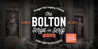
Bolton
por Fenotype
Estilos individuales desde $15.00
35% de descuento
Familia completa de 14 fuentes : $60.00


Bolton Fuente La familia era
diseñada por
Emil Karl Bertell y
publicado por
Fenotype. Bolton contiene
14
estilos y opciones de paquetes familiares.
Más información sobre esta familia
- Aa Glifos
-
¡Mejor PrecioPaquetes de familia
- Estilos individuales
- Especificaciones técnicas
- Licencias
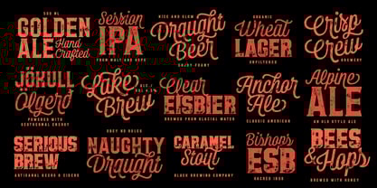
Bolton Print Family
7 fuentesPor estilo:
$7.14
$4.64
Paquete de 7 estilos:
$50.00
$32.50
Bolton Family
7 fuentesPor estilo:
$7.14
$4.64
Paquete de 7 estilos:
$50.00
$32.50
Sobre la familia Bolton Fuente
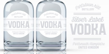
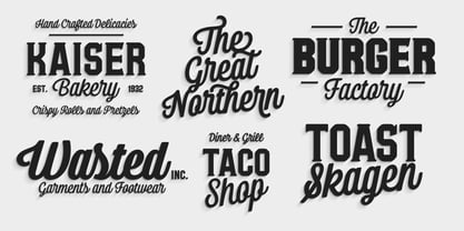
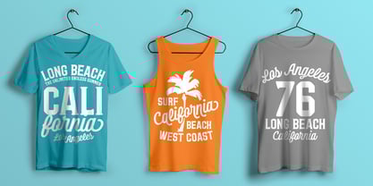
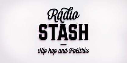
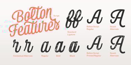
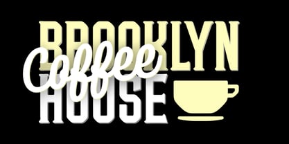
Bolton es un ambicioso pack fuente con tres pesos de script y serif y un pack de extras. Tanto el script como el serif fuentes están diseñados con formas geométricas y las mismas esquinas suaves para encajar. Bolton Print es de la misma familia con contorno rugoso y textura desgastada-de descuento . Bolton es un potente paquete para crear titulares y logotipos pegadizos. Con toda la familia podrá crear fácilmente una identidad completa para su proyecto. Bolton es ideal para marcas, envases y carteles o cualquier otro tipo de uso expositivo. Bolton Script tiene una altura x muy alta que crea formas de palabras muy sólidas. Los guiones están equipados con ligaduras estándar y alternativas contextuales para mantener la fluidez. Si necesita letras más llamativas, hay una Alternativa Swash para cada carácter básico. Bolton puede adquirirse como paquete familiar limpio o texturizado o, al mejor precio, como paquete familiar completo que contiene todas las versiones de fuente.
Diseñadores: Emil Karl Bertell
Editorial: Fenotype
Fundición: Fenotype
Propietario del diseño: Fenotype
MyFonts debut: 30 de octubre de 2017
Bolton
Acerca de Fenotype
Emil Bertell has done it all. Having published his first font files at 16, he was considered to be an international free-font hero while still in his teens. He went on to attend design college, drop out, and become a well-known graphic designer and illustrator. Now one of the most successful type designers from the Nordic countries on MyFonts, the Finland-based designer said in his Creative Characters interview that he’s “had an obsession with visual culture from the beginning.” Before turning his attention to type design full-time, Emil had a very successful career as an award-winning illustrator. “Illustration became my main livelihood,” he said. “I drew painstaking pencil illustrations for magazines, advertising, stamps, etc. I often designed my own fonts for festivals and hand-drew the lettering posters; I also did a few pencil illustrations based on lettershapes, and that got out of hand, so I had to do a lot more of them.” In 2012 he finally made the switch and committed all of his time to type design. Emil first saw success with his Billboard typeface. “It became my first Rising Star on MyFonts and made me realize that I could actually make a living by designing fonts,” he said. “I realized that there’s actually a market out there that I could become a part of.” Throughout the rest of that year he began to see even more success. It began in January, when his font, Mishka, was featured in our Most Popular Fonts of 2011 list. He went on to find a way to bookend the year and was listed among the Most Popular Fonts of 2012 with his Mercury Script design. Since then, his foundry’s success has continued on with best sellers like Voyage and The Carpenter. Fans of the foundry have a lot to look forward to in the near future. Emil will continue to produce beautiful scripts (some coming soon to MyFonts!) and has plans to expand his business.
Seguir leyendo
Leer menos