Seleccione este tipo de licencia cuando esté desarrollando una aplicación app para iOS, Android o Windows Phone, y vaya a incrustar el archivo en el código de su aplicación móvil. va a incrustar el archivo fuente en el código de su aplicación móvil.
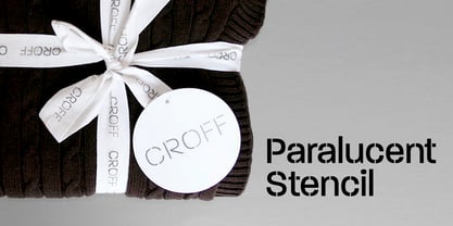
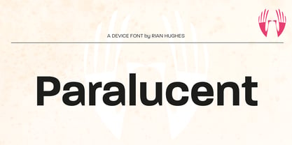
Paralucent
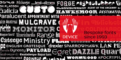
por Device
Estilos individuales desde $29.00
Familia completa de 35 fuentes : $735.00

Paralucent Fuente La familia era
diseñada por
Rian Hughes y
publicado por
Device. Paralucent contiene
35
estilos y opciones de paquetes familiares.
Más información sobre esta familia
- Aa Glifos
-
¡Mejor PrecioPaquetes de familia
- Estilos individuales
- Especificaciones técnicas
- Licencias
Paralucent Normal Family
14 fuentesPor estilo:
$22.78
Paquete de 14 estilos:
$319.00
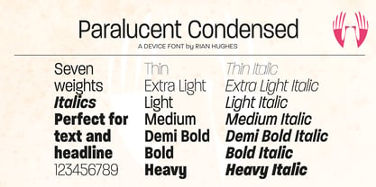
Paralucent Condensed
14 fuentesPor estilo:
$22.78
Paquete de 14 estilos:
$319.00
Paralucent Essentials
6 fuentesPor estilo:
$26.50
Paquete de 6 estilos:
$159.00
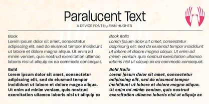
Paralucent Text Family
4 fuentesPor estilo:
$29.75
Paquete de 4 estilos:
$119.00
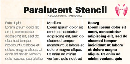
Paralucent Stencil Family
3 fuentesPor estilo:
$26.33
Paquete de 3 estilos:
$79.00
Sobre la familia Paralucent Fuente
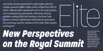
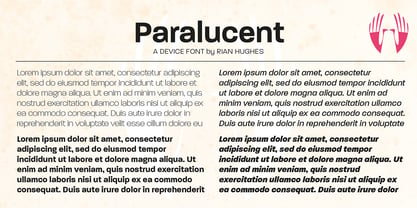
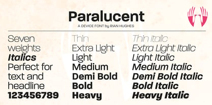
Paralucent es una versátil sans moderna polivalente. Disponible en siete pesos, de fino a grueso, y en dos anchos con sus correspondientes cursivas, evita algunas de las peculiaridades caligráficas más excéntricas de Akzidenz o Helvetica o la fría precisión de Univers para ofrecer un diseño elegante, funcional y cálido.
A la familia básica de 28 pesos se añaden dos más: una plantilla de tres pesos y una familia de texto de cuatro pesos. Los pesos de texto se han ajustado para su uso en tamaños de punto pequeños, y presentan formas de caracteres más abiertas, un espaciado entre letras más holgado para mejorar la legibilidad, y numerales alineados para su uso en listados y tablas.
El diseño de Paralucent se basa en varias ideas fundamentales. Se ha prestado especial atención al espacio negativo entre caracteres, lo que da un "color" más uniforme, sobre todo en el texto. Por ejemplo, la J, la L y la T tienen brazos más cortos que otros tipos sans comparables, mientras que la M y la W son más anchas. La A tiene una barra inferior, que abre el contador interior. La altura x de las minúsculas, inusualmente alta, contribuye de nuevo a dar un color más uniforme y mejorar la legibilidad. Se ha procurado racionalizar los elementos repetidos, como las colas de las minúsculas, o la Q y la "oreja" de la g. Las soluciones de diseño tipográfico coherentes en todos estos elementos añaden más cohesión estilística.
Las "trampas de tinta" son incisiones exageradas utilizadas para abrir los ángulos internos más estrechos de una letra, que pueden obstruirse con tinta, especialmente en tamaños de letra pequeños. Aunque en la actualidad son superfluas debido a la alta calidad de la impresión moderna, a veces se siguen utilizando como peculiaridad estilística o elemento de diseño. Ahora que los fuentes digitales suelen invertirse o contornearse, o ampliarse a tamaños enormes, también pueden dar lugar a resultados inesperados o molestos. Paralucent tiene en cuenta estas inevitables manipulaciones digitales y añade correcciones ópticas sin recurrir a trampas de tinta.
La familia ha sido seleccionada por muchas editoriales británicas y estadounidenses, y ha aparecido en revistas como Loaded, Heat y TV Quick, así como en libros de fotografía de sobremesa de gama alta y en sitios web de galerías.
Un bestseller perenne de Device.
Diseñadores: Rian Hughes
Editorial: Device
Fundición: Device
Propietario del diseño: Device
MyFonts debut: 17 de noviembre de 2004
Paralúcido
Acerca de Device
Device Fuentes es la rama fuente del estudio Device de Rian Hughes, que opera desde Kew Gardens, Londres. Device Fuentes , uno de los primeros colaboradores de la gama FontFont de FontShop, se creó en 1997 para gestionar la creciente biblioteca de Hughes. Ha publicado más de 200 tipos de letra originales que abarcan más de 1.000 pesos individuales, incluidos diseños personalizados para clientes tan diversos como Mac User, 2000AD y The Teenage Mutant Ninja Turtles. Rian estudió en el London College of Communication de Londres antes de trabajar para una agencia de publicidad, Smash Hits, la revista i-D y una serie de empresas de diseño de carátulas de discos. Bajo el estandarte del estudio Device, ofrece diseño, tipografía personalizada e ilustración para campañas publicitarias, fundas de discos, cubiertas de libros, novelas gráficas y televisión. Ha diseñado carteles para la cadena Yellow Boots de la empresa de moda Jun Co. de Tokio, la película animada de seguridad a bordo para Virgin Airlines, la campaña de carteles de Eurostar, una colección de camisas hawaianas, una gama de relojes para Swatch, el folleto de los premios de música de MTV Europa y numerosas ilustraciones de cubiertas de libros y portadas de CD. Ha diseñado numerosos logotipos para DC, Marvel, Valiant, Image y otras empresas de cómics para títulos como Batman, los X-Men, James Bond, Los Vengadores y Spiderman. Vinculado desde hace tiempo al mundo del cómic, la primera novela gráfica de Rian Hughes fue "The Science Service" para la editorial belga Magic Strip. Le siguió "Dare" para la efímera Revolver, de IPC, una "iconoclasta renovación del héroe de cómic de los años 50 Dan Dare", escrita por Grant Morrison. Sus tiras del Galaxy's Greatest se han recopilado en 'Yesterday's Tomorrows' ('Dare', 'Really and Truly' y otras) y 'Tales from Beyond Science' (escritas por Mark Millar, John Smith y Alan McKenzie). Más recientemente, ha escrito y dibujado un relato de "Batman: Black and White", ha colaborado en "Vertigo: Magenta", ha diseñado el mapa del Multiverso DC y se ha reunido con Morrison para escribir dos historias para la revista "Heavy Metal". Ha participado en numerosas exposiciones internacionales, ha dado numerosas conferencias en el Reino Unido y en otros países, y en 2003 expuso su obra en solitario en la Conningsby Gallery de Londres. En 2002 se publicó una monografía retrospectiva, "Art, Commercial", y en 2005 se publicó "Ten Year Itch", una celebración de los diez primeros años de Device Fuentes. Entre sus libros más recientes figuran "Custom Lettering of the 20s and 30s", y la novela gráfica sin palabras para todas las edades "I Am A Number", "Soho Dives, Soho Divas" recoge sus dibujos burlescos, y expone su manifiesto memético en Cult-Ure: Las ideas pueden ser peligrosas. Una colección de sus diseños de logotipos, "Logo a Gogo", fue lanzada en 2018 por Korero Press Tiene una colección de recuerdos de los Thunderbirds, una nevera llena de vodka y una pila de álbumes de música fácil de escuchar que reproduce en voz muy baja. www.rianhughes.com www.devicefonts.co.ukThe La página de fundición Premium se puede ver Aquí.
Seguir leyendo
Leer menos