Seleccione este tipo de licencia cuando esté desarrollando una aplicación app para iOS, Android o Windows Phone, y vaya a incrustar el archivo en el código de su aplicación móvil. va a incrustar el archivo fuente en el código de su aplicación móvil.
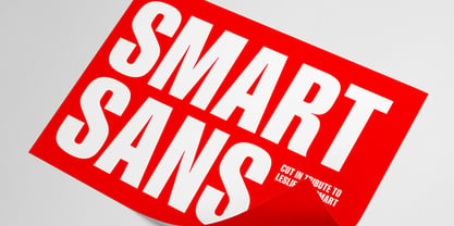
Smart Sans™
por Monotype
Estilos individuales desde $29.99
Familia completa de 3 fuentes : $205.99


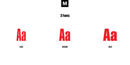
Smart Sans Fuente La familia era
diseñada por
Rod McDonald y
publicado por
Monotype. Smart Sans contiene
3
estilos y opciones de paquetes familiares.
Más información sobre esta familia
- Aa Glifos
-
¡Mejor PrecioPaquetes de familia
- Estilos individuales
- Especificaciones técnicas
- Licencias
Por estilo:
$68.33
Paquete de 3 estilos:
$204.99
Smart Sans Complete Family Pack
3 fuentesPor estilo:
$68.66
Paquete de 3 estilos:
$205.99
Smart Sans Complete Family Pack
3 fuentesPor estilo:
$62.66
Paquete de 3 estilos:
$187.99
Sobre la familia Smart Sans Fuente
Smart Sans es un homenaje personal a Leslie (Sam) Smart, el primer director tipográfico contratado por una gran casa de composición de Canadá. Smart fue un pionero del diseño del siglo XX que elevó el nivel de la tipografía canadiense. Junto con tres de sus colegas, fundó el primer Type Directors Club en Toronto.
Tras la muerte de Smart en 1998, el diseñador tipográfico Rod McDonald decidió que había que hacer algo para conmemorar su vida y sus logros. Primero pensé en crear una beca en nombre de Sam, pero el diseño de un tipo de letra pronto sustituyó esta idea", dice McDonald. "Una vez que decidí diseñar un tipo de letra, sin embargo, se convirtió en una conclusión inevitable que sería una sans serif - por la única razón de que me encantaba el nombre Smart Sans".
Dos tipos de letra sirvieron de inspiración para el trabajo de McDonald. "Como a miles de diseñadores, me entusiasma la serie Helvetica Compressed de Matthew Carter. Y, cuando era más joven, también me encantaba la serie
McDonald diseñó tres pesos para la familia Smart Sans, todos ellos idóneos para crear titulares que llamen la atención y textos impactantes. La "g" de dos alturas contribuye a la personalidad vivaz del diseño, y la "r" corta ayuda a mantener un espaciado estrecho y uniforme.
Smart Sans es el homenaje perfecto a un gran tipógrafo, porque sube el listón de lo que cabe esperar de los tipos sin gracias condensados. Sam Smart estaría encantado".
Diseñadores: Rod McDonald
Editorial: Monotype
Fundición: Monotype
Propietario del diseño: Monotype
MyFonts debut: 13 de octubre de 2005
Smart Sans™
es una marca comercial de Monotype Imaging Inc. y puede estar registrada en determinadas jurisdicciones.
Acerca de Monotype
La Biblioteca Monotype es una de las mayores y más completas colecciones de tipos de letra del mundo, con diseños originales de importancia histórica y una nueva gama de diseños contemporáneos y de moda fuentes. La Biblioteca Monotype incluye miles de clásicos atemporales, revivals artesanales y diseños originales de muchos de los diseñadores tipográficos y fundiciones más innovadores de la historia. Esta biblioteca distintiva y galardonada de primera calidad fuentes ofrece a marcas y diseñadores una selección amplia y fiable de tipos de letra para una tipografía expresiva en impresión y en pantalla. La página de la Fundición Premium puede consultarse aquí.
Seguir leyendo
Leer menos