Seleccione este tipo de licencia cuando esté desarrollando una aplicación app para iOS, Android o Windows Phone, y vaya a incrustar el archivo en el código de su aplicación móvil. va a incrustar el archivo fuente en el código de su aplicación móvil.
Haarlemmer™
por Monotype
Estilos individuales desde $29.00
Familia completa de 6 fuentes : $421.99

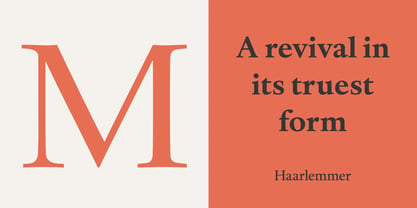

Haarlemmer Fuente La familia era
diseñada por
Frank E. Blokland,
Jan van Krimpen y
publicado por
Monotype. Haarlemmer contiene
6
estilos y opciones de paquetes familiares.
Más información sobre esta familia
- Aa Glifos
-
¡Mejor PrecioPaquetes de familia
- Estilos individuales
- Especificaciones técnicas
- Licencias
Por estilo:
$70.33
Paquete de 6 estilos:
$421.99
Haarlemmer Complete Family Pack
6 fuentesPor estilo:
$58.66
Paquete de 6 estilos:
$351.99
Sobre la familia Haarlemmer Fuente
Haarlemmer es una recreación de un tipo de letra nunca producido de Jan Van Krimpen que va un paso más allá de la autenticidad: muestra cómo él quería que se diseñara en primer lugar.
El original, dibujado a finales de la década de 1930, se creó para la Sociedad Holandesa para el Arte de la Impresión y el Libro y se iba a utilizar para componer una nueva edición de la Biblia, utilizando la tipografía Monotype. De ahí el problema: fuentes para máquinas tipográficas de metal como la Linotype y la Monotype tenía que crearse dentro de un rudimentario sistema de valores predeterminados de anchura de caracteres. Cada letra debía encajar y tener su espaciado determinado por una cuadrícula de sólo 18 unidades. A menudo, los caracteres en cursiva tenían que compartir la misma anchura que los del diseño romano. Van Krimpen creía que esto perjudicaba gravemente el proceso de diseño.
La invasión de Holanda en la Segunda Guerra Mundial detuvo todo el trabajo en el proyecto de la Biblia, y la Haarlemmer original nunca llegó a producirse. Avancemos unos sesenta años.
Frank E. Blokland, de la Dutch Type Library, quería revivir la Haarlemmer original, pero esta vez como Van Krimpen hubiera querido. Blokland reinterpretó los dibujos originales y creó un tipo de letra que se ajustaba, en la medida de lo posible, al concepto inicial de Van Krimpen. Aunque la mano de Van Krimpen ya no podía estar en el timón, un minucioso estudio de su obra compensó su ausencia.
El resultado es una excepcional familia tipográfica de tres pesos, con diseños complementarios en cursiva y un completo conjunto de versalitas y cifras de estilo antiguo. Van Krimpen estaría orgulloso.
Diseñadores: Frank E. Blokland, Jan van Krimpen
Editorial: Monotype
Fundición: Monotype
Propietario del diseño: Monotype
MyFonts debut: 13 de octubre de 2005
Haarlemmer
es una marca comercial de The Monotype Corporation y puede estar registrada en determinadas jurisdicciones.
Acerca de Monotype
La Biblioteca Monotype es una de las mayores y más completas colecciones de tipos de letra del mundo, con diseños originales de importancia histórica y una nueva gama de diseños contemporáneos y de moda fuentes. La Biblioteca Monotype incluye miles de clásicos atemporales, revivals artesanales y diseños originales de muchos de los diseñadores tipográficos y fundiciones más innovadores de la historia. Esta biblioteca distintiva y galardonada de primera calidad fuentes ofrece a marcas y diseñadores una selección amplia y fiable de tipos de letra para una tipografía expresiva en impresión y en pantalla. La página de la Fundición Premium puede consultarse aquí.
Seguir leyendo
Leer menos