Seleccione este tipo de licencia cuando esté desarrollando una aplicación app para iOS, Android o Windows Phone, y vaya a incrustar el archivo en el código de su aplicación móvil. va a incrustar el archivo fuente en el código de su aplicación móvil.
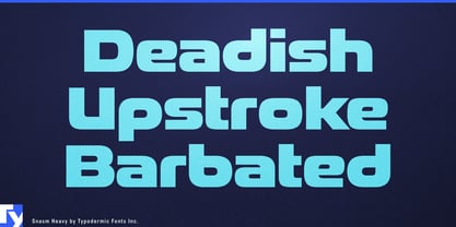
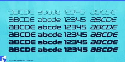
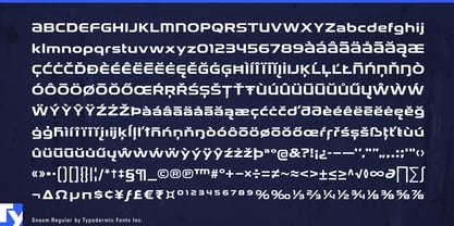
Snasm
por Typodermic
Estilos individuales desde $13.95
Familia completa de 12 fuentes : $33.95


Snasm Fuente La familia era
diseñada por
Ray Larabie y
publicado por
Typodermic. Snasm contiene
12
estilos y opciones de paquetes familiares.
Más información sobre esta familia
- Aa Glifos
-
¡Mejor PrecioPaquetes de familia
- Estilos individuales
- Especificaciones técnicas
- Licencias
Sobre la familia Snasm Fuente
El tipo de letra Snasm es un tipo de letra versátil y futurista que incorpora formas de letras modulares de finales del siglo XX, con especial atención a las formas de letras anchas. Este tipo de letra se inspira en los diseños tipográficos instrumentales de Donald Handel, conocidos por sus líneas limpias y ángulos agudos. Pero eso no es todo: Snasm también rinde homenaje a la estrategia de diseño elegante y de alta tecnología de finales de los setenta hasta principios de los noventa, como se aprecia en los logotipos de Pepsi y la Nintendo Super Famicom.
Snasm fuente no sólo es visualmente atractiva, sino que también incluye una gama de pesos y oblicuos meticulosamente construidos, lo que la convierte en un valioso activo en cualquier proyecto de diseño. Con sus mayúsculas estables y dispersas y sus minúsculas espaciosas, Snasm es perfecta para transmitir conceptos de ciencia, tecnología y precisión de alta tecnología. Esta fuente sigue el ritmo de los últimos artilugios digitales y de las tendencias en interfaces de usuario, lo que la convierte en una excelente elección para los diseñadores que quieren mantenerse a la vanguardia.
El uso de Snasm en tus diseños puede añadir un toque futurista y moderno a cualquier proyecto, tanto si estás creando un nuevo sitio web, diseñando un móvil app, o trabajando en una campaña de marketing digital. En general, Snasm es un tipo de letra tan funcional como estéticamente agradable, por lo que resulta imprescindible para cualquier diseñador que desee crear diseños de alta tecnología que destaquen entre la multitud.
Es compatible con la mayoría de los sistemas de escritura europeos basados en el latín, incluidas las siguientes lenguas. Afaan Oromo, afar, afrikaans, albanés, alsaciano, aromano, aimara, bashkir (latín), vasco, bielorruso (latín), bemba, bikol, bosnio, bretón, caboverdiano, criollo, catalán, cebuano, chamorro, chavacano, chichewa, tártaro de Crimea (latín), croata, checo, danés, dawan, dholuo, neerlandés, inglés, estonio, feroés, fiyiano, filipino, finés, francés, frisón, friulano, gagauz (latín), gallego, ganda, genovés, alemán, groenlandés, criollo guadalupeño, criollo haitiano, hawaiano, hiligaynon, húngaro, islandés, ilocano, indonesio, irlandés, italiano, jamaicano, kaqchikel, karakalpak (latín), casubio, kikongo, kinyarwanda, kirundi, kurdo (latín), letón, lituano, lombardo, bajo sajón, luxemburgués, maasai, makhuwa, malayo, maltés, maorí, moldavo, montenegrino, ndebele, napolitano, noruego, novial, occitano, osetio (latín), papiamento, piamontés, polaco, portugués, quechua, rarotongano, rumano, romanche, sami, sango, saramaccan, sardo, gaélico escocés, serbio (latín), shona, siciliano, silesio, eslovaco, esloveno, somalí, sorabo, sotho, español, swahili, swazi, sueco, tagalo, tahitiano, tetum, tongano, tshiluba, tsonga, tswana, tumbuka, turco, turcomano (latín), tuvaluano, uzbeko (latín), veneciano, vepsiano, võro, valón, waray-waray, wayuu, galés, wolof, xhosa, yapés, zapoteco zulú y zuni.
Diseñadores: Ray Larabie
Editorial: Typodermic
Fundición: Typodermic
Fundición original: unknown
Propietario del diseño: Typodermic
MyFonts debut: 15 de enero de 2013
Snasm
Acerca de Typodermic
Bienvenido a Typodermic Fuentes, una animada fundición tipográfica con sede en Nagoya (Japón), fundada por el diseñador tipográfico canadiense Raymond Larabie en 2001. Nuestra biblioteca está repleta de más de 500 tipos de letra diferentes para impulsar la creatividad en el diseño gráfico, la publicidad, la web y el desarrollo de app . Como pioneros de la tipografía digital, adoptamos pronto las licencias de fuentes y app , ampliando constantemente los límites del diseño. Con corazón canadiense y precisión japonesa, somos sus socios globales en tipografía extraordinaria. Descubra Typodermic Fuentes, donde la creatividad se une al carácter.
Seguir leyendo
Leer menos