Seleccione este tipo de licencia cuando esté desarrollando una aplicación app para iOS, Android o Windows Phone, y vaya a incrustar el archivo en el código de su aplicación móvil. va a incrustar el archivo fuente en el código de su aplicación móvil.
Flexo™
por Durotype
Estilos individuales desde $0.00
Familia completa de 17 fuentes : $279.00


Flexo Fuente La familia era
diseñada por
Ben Blom y
publicado por
Durotype. Flexo contiene
17
estilos y opciones de paquetes familiares.
Más información sobre esta familia
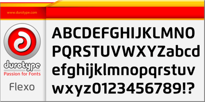
- Aa Glifos
-
¡Mejor PrecioPaquetes de familia
- Estilos individuales
- Especificaciones técnicas
- Licencias
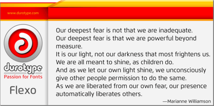
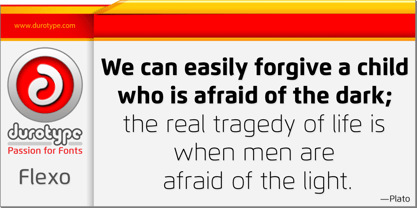
Sobre la familia Flexo Fuente
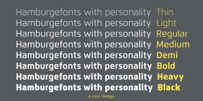
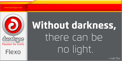
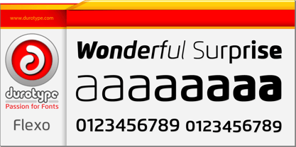
Flexo es un tipo de letra sans geométrica, con calidez humanística. Es una síntesis de lo geométrico y lo humanístico. Posee a la vez rectitud matemática y refinamiento humanístico.
La flexografía tiene un diseño cuadrado que la hace destacar en muchos usos. Destaca tanto en titulares como en texto. Es muy adecuada para el diseño gráfico y el diseño de identidad corporativa. Flexo tiene dieciséis estilos, amplia compatibilidad lingüística, ocho tipos diferentes de figuras y sofisticadas funciones OpenType, por lo que está preparada para proyectos tipográficos avanzados.
Demostración gratuita disponible en fuente .
Flexo en uso: 1 2 3 4 5 6 7 8 9 10 11 12 13.
Para obtener más información sobre Flexo, descargue el Manual de muestras en PDF.
Diseñadores: Ben Blom
Editorial: Durotype
Fundición: Durotype
Propietario del diseño: Durotype
MyFonts debut: 25 de febrero de 2012
Flexo
es una marca comercial de Durotype.
Acerca de Durotype
Durotype is an innovative font foundry based in Best, The Netherlands. It has been founded by Ben Blom in 2010. All Durotype fonts are created out of passion for the design involved. They are crafted in a long process of creation and improvement, until the right fusion of the functional and esthetical has been achieved. With whatever passion they are created—Durotype fonts are, in the end, just high-quality tools with a bit of pizzazz. Most of them are rather universal tools: their design doesn’t determine any specific uses. Many of them are very versatile: they have many styles and many glyphs. Many of them are, given their design, crafted in a way to maximize their legibility. Durotype fonts are meant to be durable: in many years from now, they should be just as enjoyable and useful as they are today. Durotype fonts have been deployed successfully in many areas. In financial services, entertainment, and museums. In television, marketing, and corporate identities. In technology, sports, automotive, and real estate. In food, retail, B2B, and health. In e-books, apps, ATMs, and video phones. In web sites, catalogs, signage, and packaging. Et cetera. Durotype’s most successful fonts are Flexo, a squarish design (MyFonts Most Popular Fonts of 2012), and Aspira, a legible geometric family with a very big number of styles. Flexo in use: 1 2 3 4 5 6 7 8 9 10 11 12 13. Aspira in use: 1 2 3 4 5 6 7 8 9 10.
Seguir leyendo
Leer menos