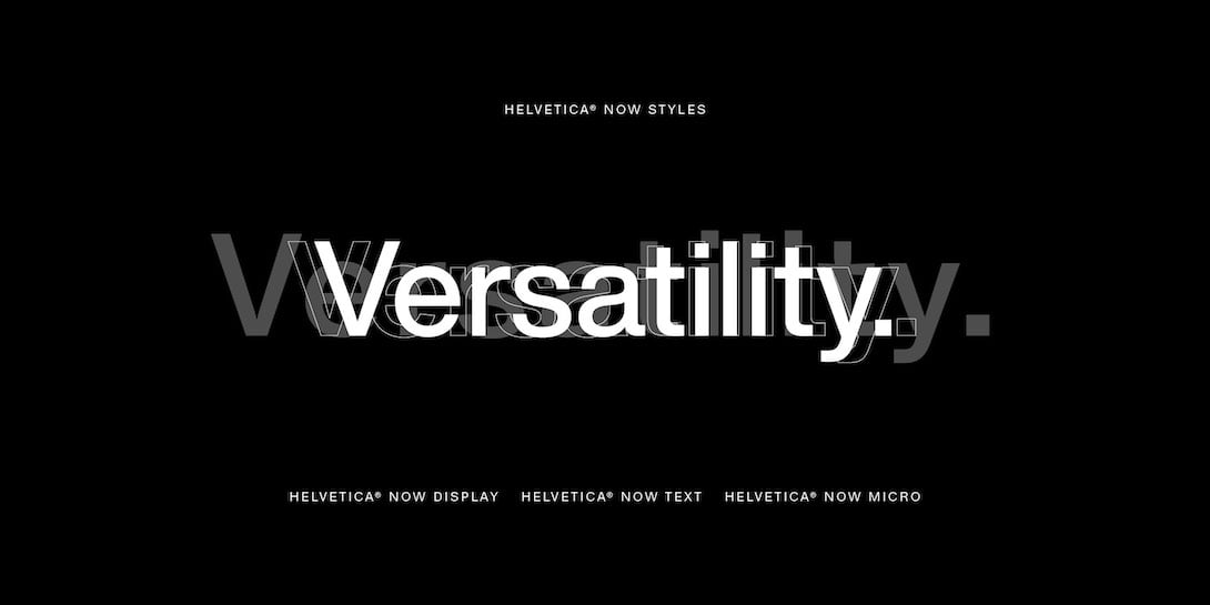


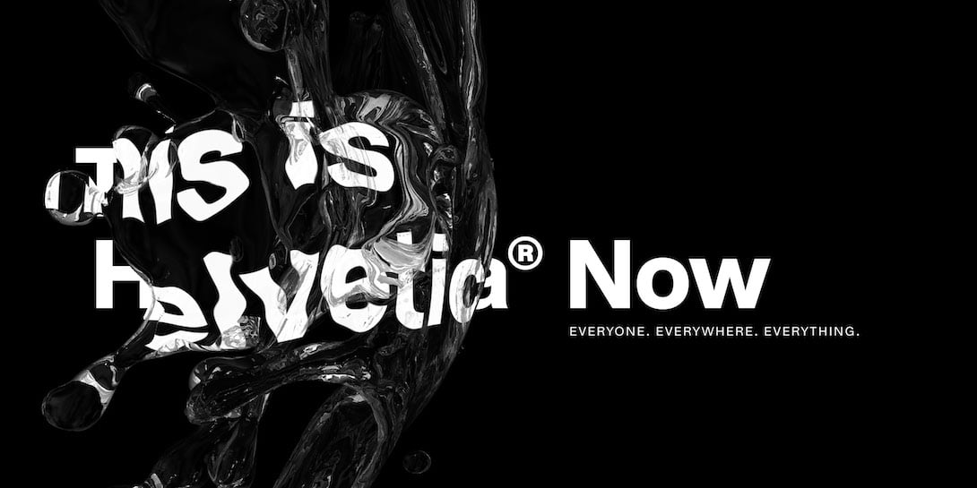
Helvetica Now
Why switch to Helvetica Now
It’s been over sixty years since Helvetica was released, but the typeface has remained many designers’ first choice for clarity and simplicity. But as with many typefaces, the expectations of it have grown. Helvetica is now expected to function in a growing range of environments, and at a broader variety of sizes than ever before.
Designers and studios are likely familiar with Neue Helvetica – which was released in 1983 and the last major update to Helvetica – but it is nevertheless the product of a pre-digital era. Here’s four ways Helvetica Now improves on this popular standard bearer.
The Sizing
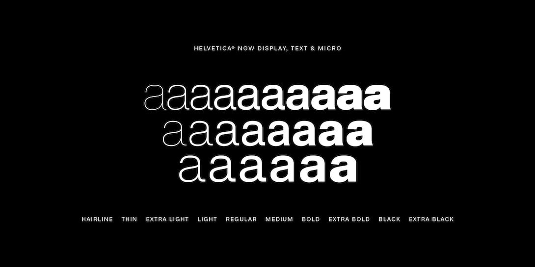
Helvetica Now offers Micro, Text and Display sizes, each of which is suited to a specific use case – unlike Neue Helvetica which was intended for use in text type. Designers working on large scale applications will find Helvetica’s characteristic shapes emphasized in the larger Display versions, which have been spaced with headlines in mind. It’s Helvetica, but with more aplomb and confidence, and more opportunities for designers to explore. For those concerned with print legibility and body copy, Helvetica Now’s Text sizes are a workhorse, offering lively strokes and comfortably loose spacing.
The Micro versions are perhaps the most shows-topping aspect of Helvetica Now, and address an issue Helvetica has suffered – that of being ‘micro type challenged’. While Neue Helvetica struggles at tiny sizes – for example on modern digital devices – Helvetica Now’s Micro designs are optimized for small-size performance. They maintain the look of Helvetica at small sizes and their spacing is loose, which aids legibility at microscopic sizes and across low-res environments.
Each size was been designed with its end use in mind, and precisely adjusted to fit the requirements of those environments. This means designers can use the typeface straight out of the box – unlike Neue Helvetica – with no need for extra kerning or typographic wizardry.
The Palette
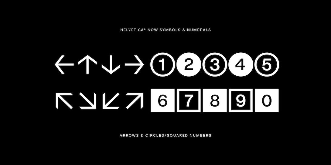
Helvetica Now has been designed as a complete toolbox, allowing the font’s more expressive side to emerge. The family offers a full suite of alternate characters to choose from, allowing it to adopt subtly different voices as required.
Designers can now work with Helvetica Now’s circled figures, as well as the Helvetica-style arrow –elements they previously had to borrow from other typefaces or create on their own. These features are included in every weight and style, giving Helvetica Now greater flexibility for use in information graphics, as well as signage.
The Details
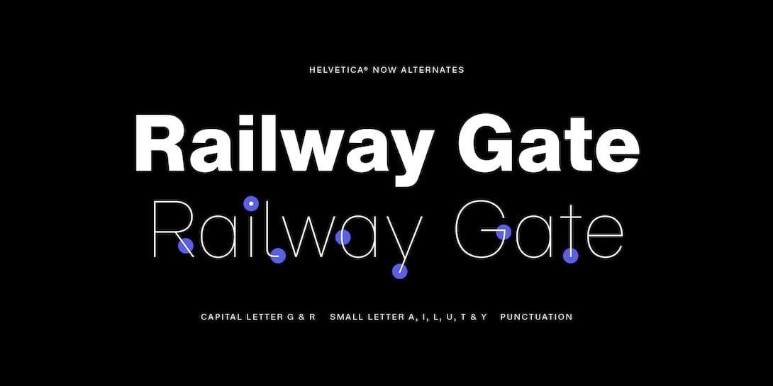
Helvetica Now is more than a refresh or an update. Monotype’s team of designers returned to the original drawings, then reassessed and redrew every single glyph in the family, adding popular modifications developed over the years. Recurring issues, such as the easily confused capital I and lowercase l have been addressed, with a hooked version of the lower-case l that increases legibility at smaller sizes. Other new glyphs include an updated @, rounded punctuation, a rounded G, a straight-legged R, a single-story a, and a lowercase u without a trailing serif.
While these new glyphs give Helvetica Now more range than its predecessors, it’s also a return to the original concept and soul of the design. Monotype’s design team worked within a strict philosophy while designing Helvetica Now, dedicating to minutely refining each letter while adhering to the typeface’s mantra of clarity, simplicity and neutrality.
“When you go back to the original source, it’s so much more readable and that doesn’t have to do with the forms themselves, but the spacing,” says Monotype Type Director Charles Nix. “It was about studying the spaces between the letters and figuring out what the methodology was early on, how it made the type so much easier to read, and then restoring that and improving upon it.”
It’s Not What You Expect
Helvetica is, perhaps, the best-known typeface around, and as such the design elicits strong feelings from designers and end users alike. However, Helvetica Now challenges much of what we think we know about the font. It embraces the original spirit of the design, but charts a new course for its story.
Designers familiar with Neue Helvetica will find that Helvetica Now is an entirely new creature – larger, more expressive, and with greater potential for users to explore. It retains the original’s much-loved neutrality, but also offers the chance for it to take on a new voice or persona.
“I think we’ve introduced a new chapter to the Helvetica canon— one which will allow it to become something completely novel in the hands of 21st century designers. We’ve carefully expanded a strict heritage that could have prevented its evolution,” says Nix.