DIN Next Shapes
About DIN Next Shapes
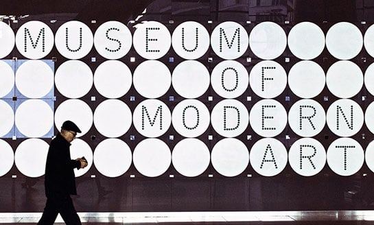
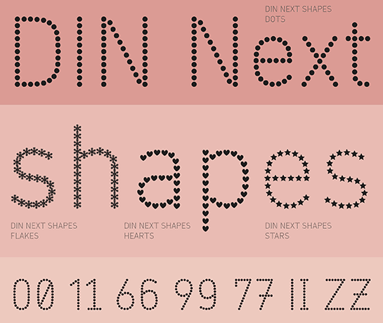
An unusual design approach brings variety to your work: in DIN Next Shapes, Sabina Chipară puts the technical and industrial letters of the DIN font into a completely new guise, recreating the basic form of the font with different symbols. When used in large font sizes, the dots, snowflakes, hearts or stars will not only make for eye-catching designs, but unique ones as well.Sabina Chipară started her typographic experiments with the dot – a symbol that perfectly matches the structured ambiance of DIN Next. She not only found the right size to make the font neither illegible nor too bold, but also noted that manual positioning of the shapes is superior to any automated process. Only then did she succeed in preserving the character of the font and in rendering critical elements like accents cleanly.
 In a further design step, the designer replaced the dots with snowflakes, hearts and stars. Finally, she added four different styles, DIN Next Dots, Stars, Flakes and Hearts.
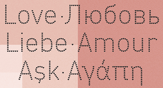
In addition to a pan-European language support with Greek and Cyrillic characters, you can also use some ligatures and alternative letter forms.
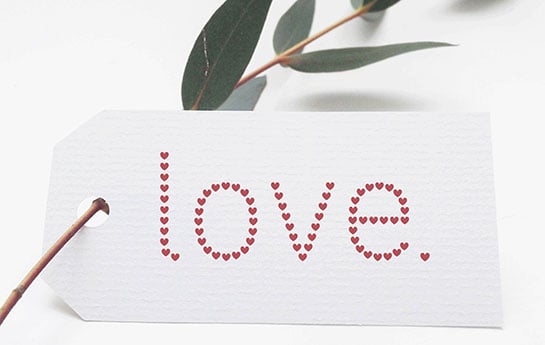
 DIN Next Shapes needs to be of a certain size for the shapes to come into their own. You can use the font alone in headlines or on greeting cards, for example. DIN Next Shapes is also suitable as a companion to DIN Next and can add a special accent to your designs.

