FF Nort
FF Nort, a well-equipped sans serif, not just for signaling
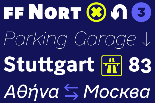
 FF Nort™ by Jörg Hemker is an openly designed, highly readable and perfectly equipped sans serif. FF Nort is not only suitable for signaling, but thanks to its restrained character, it can also be used in corporate design, advertising or long texts.
About FF Nort
The Transport signaling typeface was created for British street signs in the late 1950s. With its neutral and open, highly readable yet distinctive forms, Transport is also popular for design applications. Jörg Hemker was also enthusiastic about the font and had considered a redesign as early as the 1990s. Due to the size and complexity of the project, he had postponed it again and again – until now.Ultimately, Jörg Hemker did not follow the path of a redesign, but used Transport as inspiration, dealt intensively with the individual letters, found the formal qualities and rejected design decisions that were not ideal from his point of view. Without claiming to replace Transport or even to draw the better sign typeface, a new design with the name FF Nort was created. For example, Jörg Hemker uses rounded instead of sharp line ends, which together with the open and spacious design determine the character of the font.
In addition, clear letter forms ensure that FF Nort is easy to read, even in small sizes or under difficult conditions.
FF Nort comes in eight finely graduated weights, each with a true italic and modified letter forms for “a” and "e”. Apart from good language support with characters for Greek and Cyrillic, Jörg Hemker also provides a two-story “g" or alternatives for “3” and “G”, for example. In addition, some ornaments and numerous arrows and symbols are offered.
Although FF Nort derives from a script for signaling, it can also score in other areas. Use the well-equipped sans serif for large corporate designs, headlines or long texts, for example.