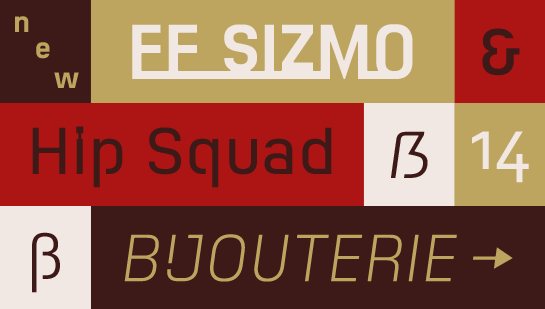
FF Sizmo
Introductory offer: 75% discount on the complete FF Sizmo family
Take advantage of this great introductory offer and license the new FF Sizmo family by November 22, 2017.You can download FF Sizmo at the introductory price here. With FF Sizmo™, Verena Gerlach introduces a two-in-one font. Both versions share open forms with a slightly technical yet distinctly friendly flair. Whilst the basic version characters are separate as usual, FF Sizmo Line has a continuous baseline to connect the characters. You may use FF Sizmo for a diversity of applications such as short text, corporate designs, signaling systems or headlines and logos, of course. This is precisely where the striking FF Sizmo Line will bring its strong character perfectly to the fore.
The Sizmo idea struck Gerlach when she came across an old, manual information system in the former “Haus des Lehrers” in Berlin. The characters were milled into wood, with a baseline by which they were clamped behind slats. Inspired by the technical and somewhat stenciled ambience of the all caps font, Gerlach transcribed the flair of wooden characters to the digital world - without, however, losing the characteristic elements of milling. Whilst FF Sizmo displays sharp edges on the outside, the corners are slightly rounded on the inside – as if milled with a round bit. A striking design knack rendering the font friendly and softly radiant. The distinct shape of the characters such as the open “p” and “q” punches or the right angles in “a” and “d” will furthermore ensure a high recognition value.
The open formed, well-structured FF Sizmo with its five stroke weights, including Italic, and its generous finish will be ideally suited for analog and digital projects. Its design-oriented appearance renders FF Sizmo the ideal choice for headlines, banners and short text, yet the font will also meet the challenges of corporate designs or signaling systems with aplomb.
Analogous to FF Sizmo, FF Sizmo Line also offers five stroke weights. With its striking character, the font will impress as stand-alone - headlines or logos, for example – but it will also look good as partner and supplement to a basic version. Incidentally: With FF Sizmo Line, OpenType features will ensure a continuous line with matching beginnings and endings.
