Select this license type when you are developing an app for iOS, Android, or Windows Phone, and you will be embedding the font file in your mobile application's code.
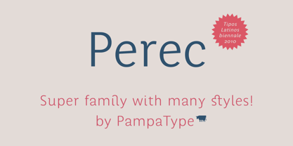
Perec
by PampaType
Individual Styles from $29.00
Complete family of 3 fonts: $99.00
Perec Font Family was
designed by
Alejandro Lo Celso and
published by
PampaType. Perec contains
3
styles and family package options.
More about this family
- Aa Glyphs
-
Best ValueFamily Packages
- Individual Styles
- Tech Specs
- Licensing
-
Perec SuperNegra
-
Perec SuperNegra Versalita
-
Perec SuperNegra Italica
Per style:
$19.66
Pack of 3 styles:
$59.00
Perec SuperBlanca Set
3 fonts-
Perec SuperBlanca
-
Perec SuperBlanca Versalita
-
Perec SuperBlanca Italica
Per style:
$19.66
Pack of 3 styles:
$59.00
Perec Negra Set
3 fonts-
Perec Negra
-
Perec Negra Versalita
-
Perec Negra Italica
Per style:
$19.66
Pack of 3 styles:
$59.00
Perec Ludique Set
3 fontsPer style:
$33.00
Pack of 3 styles:
$99.00
Perec Gris Set
3 fonts-
Perec Gris
-
Perec Gris Versalita
-
Perec Gris Italica
Per style:
$19.66
Pack of 3 styles:
$59.00
Perec Blanca Set
3 fonts-
Perec Blanca
-
Perec Blanca Versalita
-
Perec Blanca Italica
Per style:
$19.66
Pack of 3 styles:
$59.00
About Perec Font Family
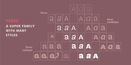
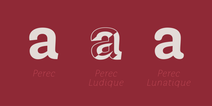
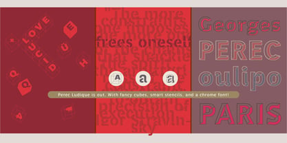
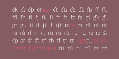
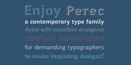
Georges Perec (1936 - 1982). French poet, novelist, scientific documentalist, composer, author of radiophonic pieces, lover of puzzles, film maker, parachutist, player of go, and author of the most difficult crosswords, Georges Perec is one of the most original writers of the literary revitalization of the second half of the 20th century. He was a member of the OuLiPo (Ouvrier de Littérature Potentielle) including people like Raymond Queneau, Harry Matthews, and Italo Calvino, a group that pursued a radical innovation of literature employing imaginative methods based on the idea of constraints. Perec’s œuvre radiates an invigorating ludic sense, and his meticulous tales, acrobatically run across all literary genres and all époques. Among his most celebrated novels there are: Life: A User’s Manual (La Vie mode d'emploi, 1978), A Gallery Portrait (Un cabinet d'amateur, 1979), and A Void (La Disparition, 1969, a lipogram, that is a text written without ever using the letter “e”). The type family Perec pays tribute to the genius of Georges Perec, it is a versatile super family that can be used at a wide range of applications, formed by three subfamilies: —Perec, a sensitive sanserif grotesque, including 15 fonts: romans, italics, and small caps declined in five weights. With a more delicate spirit than that of a sans grotesque Perec performs well not only in display sizes where elegance and flair are needed, but also in text sizes as its open counters make it comfortably readable. Its smooth color texture and range of weights from SuperBlanca to SuperNegra allow for a pleasant reading experience. —Perec Ludique, a more relaxed display series, including five fonts: —Ludique Cubes, a crosswords puzzles font —Ludique OncleJacques, a tribute to jeweller and pearls dealer Jacques Bienenfeld, great-uncle of Georges who made it possible for his Polish parents settle down in Paris where “Jojo” was born and grew up —Ludique Pochoir, an unconventional stencil —Ludique Scripte (not yet released), an informal script which combines nostalgia and gentleness, and that gives you all writing style possibilities: all letters linked, all letters unlinked, and an auto-driven in-between choice. Ludique Scripte includes also many contextual alternates, ending sorts and swashes. —Perec Lunatique (not yet released), a rounded sanserif subfamily declined in 15 fonts: romans, italics, and small caps for both text & display use, including several non-conventional beautiful ligatures. All Perec fonts take advantage of OpenType, ligatures, alternate glyphs, three sets of figures (uppercase, lowercase, and small caps case), and more contextual elements. Visit www.PampaType.com for more information on the Perec™ typefaces.
Designers: Alejandro Lo Celso
Publisher: PampaType
Foundry: PampaType
Design Owner: PampaType
MyFonts debut: Apr 1, 2011
Perec
About PampaType
PampaType was founded in 2001 by Alejandro Lo Celso with the idea of developing fine typefaces with a singular Latin flavor. Alejandro has worked as an art director in Buenos Aires, a professor in Mexico, and has studied type design in Europe. “Naturally your education and your beliefs all travel with you and are present in everything you do,” he said in his Creative Characters interview. “I think my experiences have made me more aware of the cultural context of things. Typography is a universe of subtle differences. So you need sharp intellectual tools in order to deal with its huge variety.” His letterforms are striking and adventurous; simultaneously useable and great fun.
Read more
Read less
- Choosing a selection results in a full page refresh.