 FF Netto®
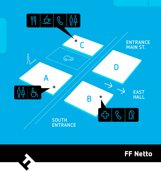
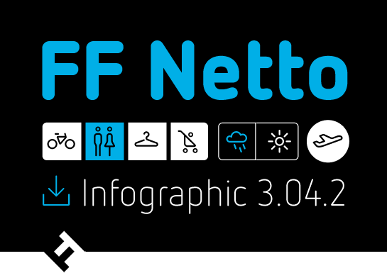
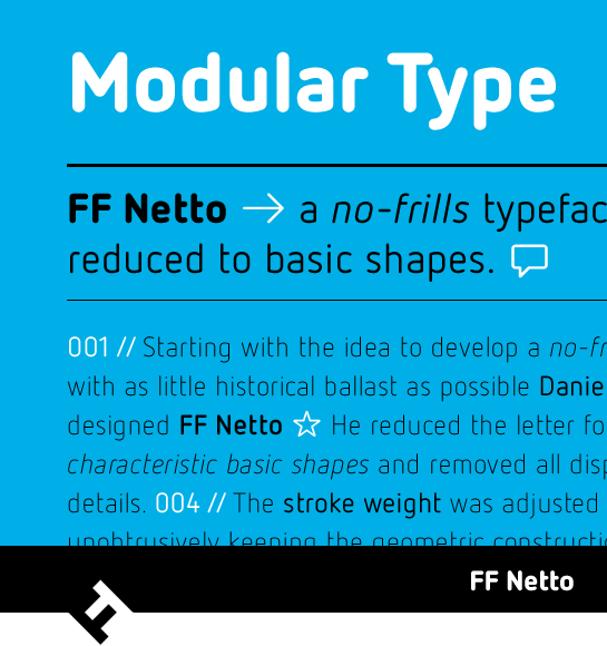
 started with the idea of designing a font without graphic extras and as few historical references as possible. To make the idea a reality, German typeface designer Daniel Utz reduced the letters to their characteristic base form and avoided all nonessential details. The letter form is based on the superellipse and curves are always designed with a linear vertical proportion. This lends FF Netto a slightly formal, somewhat technical and stencil-like character, which is enhanced by rounded ends and a mono-linear design. A large x-height and open counters ensure that FF Netto is easily legible even in small sizes and on signs. In addition, three styles with symbols and arrows of various weights make FF Netto ideal for use on signs or in signalization systems.
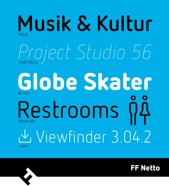
The current features of FF Netto resulted from a revision in 2012. Utz not only adjusted some of the curves, but also added the extreme weights Thin and Black, as well as Italic styles. As a result, FF Netto is available in five weights with matching italics.
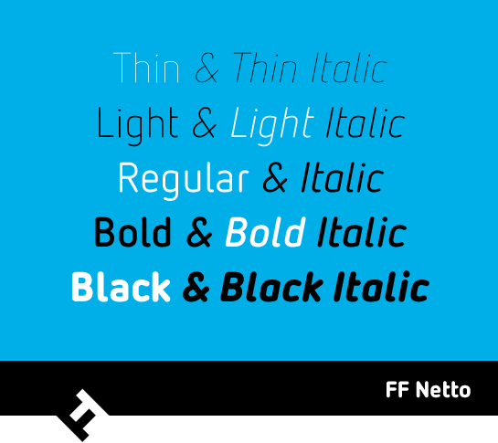
FF Netto is a restrained, even somewhat cool typeface that reveals its qualities only when you look closely. The thoughtful and balanced forms are suitable both for headlines and short texts. Along with the perfectly designed pictograms, FF Netto also cuts a fine figure in signalization systems.

 FF Netto® started with the idea of designing a font without graphic extras and as few historical references as possible. To make the idea a reality, German typeface designer Daniel Utz reduced the letters to their characteristic base form and avoided all nonessential details. The letter form is based on the superellipse and curves are always designed with a linear vertical proportion. This lends FF Netto a slightly formal, somewhat technical and stencil-like character, which is enhanced by rounded ends and a mono-linear design. A large x-height and open counters ensure that FF Netto is easily legible even in small sizes and on signs. In addition, three styles with symbols and arrows of various weights make FF Netto ideal for use on signs or in signalization systems.
 The current features of FF Netto resulted from a revision in 2012. Utz not only adjusted some of the curves, but also added the extreme weights Thin and Black, as well as Italic styles. As a result, FF Netto is available in five weights with matching italics.
 FF Netto is a restrained, even somewhat cool typeface that reveals its qualities only when you look closely. The thoughtful and balanced forms are suitable both for headlines and short texts. Along with the perfectly designed pictograms, FF Netto also cuts a fine figure in signalization systems.
