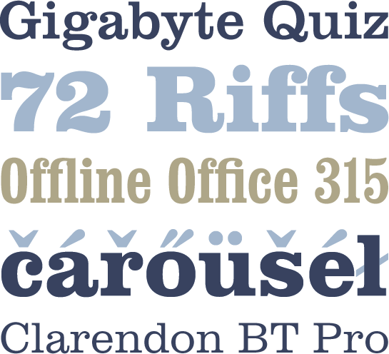
Clarendon BT Pro
Clarendon BT OpenType Pro: A popular slab serif goes international
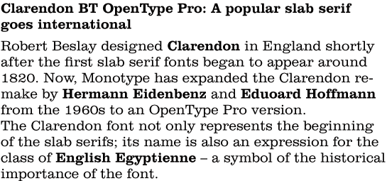
Robert Besley designed Clarendon in England shortly after the first slab serif fonts began to appear around 1820. Now, Monotype has expanded the Clarendon remake by Hermann Eidenbenz and Eduoard Hoffmann from the 1960s to an OpenType Pro version. The Clarendon® font not only represents the beginning of the slab serifs; its name is also an expression for the class of English Egyptienne – a symbol of the historical importance of the font.
With its strong, very uniform contrast in stroke width, the large x-height, the characteristic drops and of course the distinctive slab serifs, the font remains a very popular representative of its genre. Since it is easy to read, even in small sizes, Clarendon can not only be used for headlines and titles, but also for short texts.

 The present font, available in five weights with two additional Condensed styles, has been expanded significantly to OpenType Pro specifications. The most prominent new feature is the support for numerous other languages, especially from Central Europe, such as Czech, Hungarian and Polish.

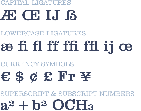
 The OpenType Pro version of Clarendon has been expanded in other ways, as well. Now, additional ligatures and currency symbols are available, as well as superscript and subscript numbers. As always, the OpenType Pro version is available in the familiar styles.
 The expansion, however, makes the popular and often-used Clarendon even more international, with greater applicability.
Take advantage of the new OpenType Pro version in order to make your existing projects fit for new language areas or to create new projects in additional international languages.


