Coleface
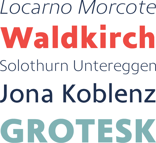
Coleface: a modern, elegant and rhythmic sans serif from Roy Cole
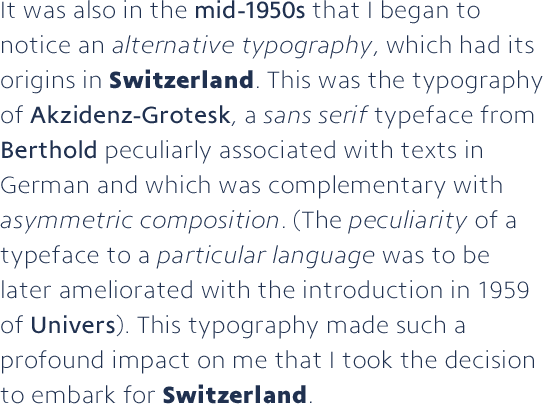
Before Roy Cole began making his own fonts, he worked as a successful graphic designer for many years. Coleface, his last font, not only boasts clear and distinctive letter forms, but can also be used in many different areas thanks to its neutral character.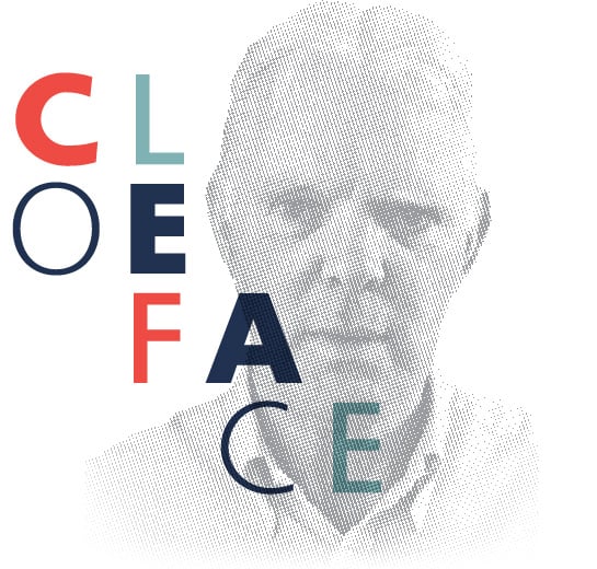 The passionate graphic designer and photographer Roy Cole was born in England in 1932 and at the age of 14 began an apprenticeship as a typesetter. He encountered Swiss typography in his profession in the years that followed and was enormously influenced by it. To Cole, it was modern and forward-looking and, as he wrote in a retrospective article in 1997, led him to study at the “Allgemeine Gewerbeschule” in Basel. Emil Ruder, one of the best known and most influential typography teachers of the 20th century, became his tutor. Cole went on to work as a graphic designer for various companies in Britain and Switzerland. In 1981, he founded his own Studio, which focused on book design. In 2003 he created his own font label, “Roy Cole Typography“. Cole was dedicated to the design of sans serif typefaces in the tradition of Swiss typography. He created four font families and completed the last font, Coleface, just a few weeks before his death in 2012.
Read more about Roy Cole and other details from his life in our designer portrait.
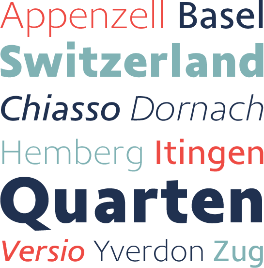 The clear lines of the sans serif Coleface combine influences of the structured grotesque with elements of Renaissance Antiqua, which creates a very particular, very characteristic tension. The light contrast in the stroke weight lends a lively and dynamic character to the font, as do several slanted line ends such as in the lowercase “a“, “c“ or “e“. Rectangular and vertical stems in the capital letters “M“ and “N“, equal length bars in “E“ and “F“ and the rectangular points give Coleface a somewhat formal rigor. The arches that taper in at the stem and merge into a straight line, such as in “a“, “d“ or “h“, as well as the “c“, which is tilted slightly away from the direction of writing, underline the slightly rough character of Coleface.

Last but not least, open counters and a large x-height make the font perfectly legible even in the smaller font sizes.
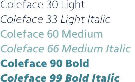
Coleface is available in three weights: Light, Medium, and Bold, each with a matching italic. In this way, you can use it for many diverse design tasks.
Take advantage of the sans serif Coleface with its rhythmic, elegant and very readable character for a variety of applications. Coleface cuts a great figure in text as well as headlines.
