DIN Next Slab
The new DIN Next Slab: Now even more design possibilities with the popular DIN Next
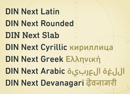
With its technical and neutral character, DIN Next™ has earned a permanent place in contemporary typography. Now, DIN Next Slab expands the font family further, offering new design potential.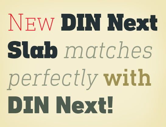 The original shapes of the DIN typeface originated about 100 years ago, at the beginning of the 20th century. They were first used for locomotives and, a bit later, for signs in train stations. Designed by engineers, the DIN typeface is, above all, easily reproduced mechanically. In 1936, the font – available in only two styles (condensed and normal) – became a standard for the Deutsches Institut für Normung e.V. (DIN - “German Institute for Standardization”). To this day it is used on traffic signs, such as the German highways. Designers also like the technical and formal font, however, and have been using the DIN fonts for their designs increasingly in recent decades. To free the DIN typeface of its numerous typographic shortcomings and provide it with suitable features for graphic applications, DIN Next was created in 2009 under the direction of Akira Kobayashi at Linotype. There are now seven weights, italic styles, small capitals and medieval characters.
Now comes the next step, DIN Next Slab, also produced under the direction of Akira Kobayashi. On a team with Sandra Winter and Tom Grace, Kobayashi is creating the new font variant based on the optimized shapes of DIN Next. The expansion will make the popular font all the more flexible and versatile. Apart from that, the geometric slab serifs underline the technical and formal nature of the font and emphasize a central design element of DIN Next.
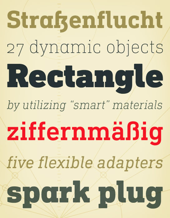 However, the team did have some challenges to overcome. While it is relatively easy to imagine DIN Next Light with slab serifs, the amount of available space quickly disappears when it comes to the Black styles. Winter explains that many tests and trials were necessary to find a compromise between space, letters and the serif shapes. Experiments with modified contrast in the weight or only one-sided serifs were quickly abandoned. The central, technical and powerful character of the font changed too much. Nevertheless, it was necessary to simplify slightly the shape of some letters, such as the “k” or “x”, for example. These changes, first developed in the Black styles, were applied to all weights in order to lend the font a consistent appearance.
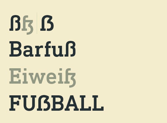
Alternate characters included in DIN Next reappear in DIN Next Slab. For example, you can use the closed “a” or the number 7 with a crossbar. Alternatives were also created for the numerals 6 and 9 and the 0 has an additional version with a horizontal line. German typesetters can also look forward to the newly added uppercase ß.
Alternate characters
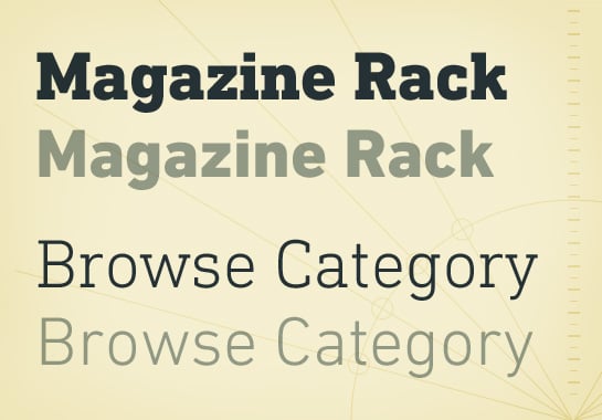
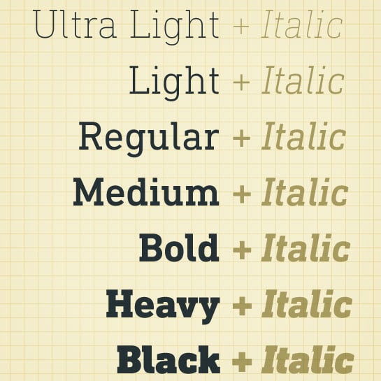 DIN Next Slab harmonizes perfectly with the styles of DIN Next: the basic letterforms and weights are identical. Both versions of the font can work together perfectly, not just in headlines and body text, but also within a text; they complement each other very well as design variations.
Examples of the varied potential for combination of DIN Next and DIN Next Slab
Example 1: Use of DIN Next and DIN Next Slab in a text with the headings and continuous text In the example above, DIN Next Slab was used for the heading and DIN Next for the continuous text. In the example below, the fonts were used in the opposite order, with DIN Next as the headline and DIN Next Slab as the body text. Both look harmonious and offer perfect legibility, only the appearance of the two font samples is slightly different: The upper example opts for an expressive title with the use of the strong DIN Next Slab. The body text here appears more sober and restrained in the clear DIN Next font. In the second example, DIN Next Slab was chosen for the headline and DIN Next for the continuous text – this works well and is more classic in appearance.
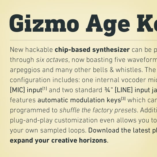 Image 1
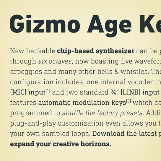 Image 2
Example 2: Use of DIN Next and DIN Next Slab in combination in continuous text In the example above, the main part of the text was set in DIN Next; DIN Next Slab is used to emphasize certain words. In the example below, DIN Next Slab acts as the main font and the accents were created with DIN Next. Both text samples work harmoniously. At the same time, however, the combination of a sans serif and a slab serif creates a certain tension that makes the reading of longer texts more pleasant.
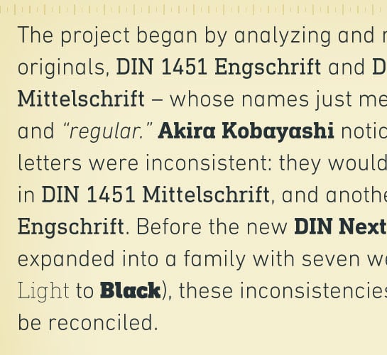 Image 1
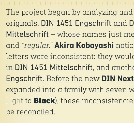 Image 2
With the new DIN Next Slab, Monotype expands the DIN Next super family consistently. With DIN Next Slab, you can underscore the technical and formal nature of the understated font not only in headlines, but in texts, as well. In this way, you have new and diverse potential for application, thanks to the way the different styles of DIN Next combine perfectly.
