Discover legacy content from linotype.com, preserved for your reference.
Neue Frutiger
Neue Frutiger Thai
In collaboration with Adrian Frutiger, Anuthin Wongsunkakon – designer of the famous Thai font families Anuparp Thai and Ut Sa Ha Gumm Thai – has expanded Neue Frutiger with a Thai variant. The Thai characters are available both in a traditional and modern style.
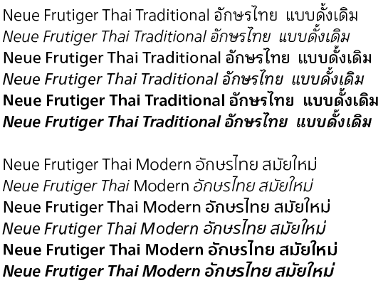
Neue Frutiger Thai is available in Light, Regular and Bold, all with the corresponding Italics
Read the following information on Neue Frutiger Thai, submitted by Anuthin Wongsunkakon, the designer of this font family:
The Frutiger Thai fonts are multi-purpose: one has terminal loops, the other does not. The two alternative letterforms result from our observations of current and former trends in Thai typography, as well as our desire to create fonts that complement the minimalist of the Latin Frutiger.
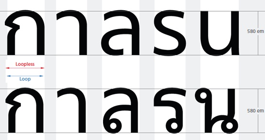
Width comparison between the design of Neue Frutiger Thai Modern with loop-less terminals (upper line) and Neue Frutiger Thai Traditional with loop terminals (lower line)
So why two sets of letterforms for the same face? To answer that question, a little explanation is in order.
A prevailing notion in Thailand’s typographic circles is that the loop is to Thai letters as the serif is to Latin characters. (Theoretically, the loop cannot be compared to the serif.) Taking this notion further, Thai characters without the loop are pushed into the same classification as the Latin sans serif. And when mixing Thai and English scripts in a type composition, the fonts employed should be of the same classification; otherwise the result is thought to be in bad form. In fact, many Thai fonts with loops can be set side by side with Latin sans serif type without creating visual discord. Nevertheless, such a notion exists. The reverse – setting a Latin serif font in mixture with Thai loop-less characters – is strange.
The notion of same-class type mixing has developed as a consequence. Designers have come to take it for granted that looped fonts are to be employed with Latin serif fonts, while loop-less is complementary to Latin sans serif fonts, and so on.
It appears such thinking has been influenced by the principle of type classification employed in Western typography. On this note, many Thai fonts may be classified along Western lines into Oldstyle, Transitional and Modern categories. The terminal loop, however, can have a variety of variations that make it hard to fit into such classifications. The letterforms of the loop-less faces, by contrast, conform more readily with the Western systems.
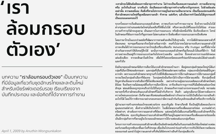
Sample of the popular Thai typesetting approach to use loopless terminals for headlines and subheadlines while body text is set with loop terminals
For both options of Frutiger Thai to succeed in this market it will take a measure of understanding within the design community of the history of Thai typographic development and the broad classification of today’s Thai type as discussed above. Frutiger Thai is purposely crafted to bridge the divide between the with-loops and loop-less alphabets, thus offering greater flexibility for type work that needs to switch between these two categories. As tastes for reading materials change, people’s reading habits will most likely adapt to new typographic devices and font offerings. The release of Frutiger Thai reflects our anticipation of that change.
For type work that involves mixing Thai and English scripts, Frutiger Thai provides designers with the convenience to either set a Thai font with loops, or one without, alongside the sans serif Frutiger. The traditional-minded compositors, who believe that Thai body text is the sole domain of loop terminals, may go for the loops; while those with a modernist outlook may opt for the loop-less face.

Side by side comparison of both version of Neue Frutiger Thai:
Neue Frutiger Thai Modern on the left side, Neue Frutiger Thai Traditional on the right side
Frutiger Thai’s letterforms are shaped not only for harmony – when cast side by side with the Latin Frutiger – but also for high legibility and proportional appeal. Its glyphs were first set to replicate the look and feel of the original Frutiger sans serif in order to obtain a set of Thai characters without loops. The claver fit of outlines circlets were then added to the structure of the loop version. It takes extra reengineering to accommodate the loops while maintaing the flair of the original Frutiger.
In order that the display of Neue Frutiger Thai functions fully, the text needs to be set with "Adobe World Ready Paragraph Composer". If the default setting "Adobe Paragraph Composer" is used, the positioning of the accents will not function correctly. InDesign supports Thai using this setting as of version CS4.
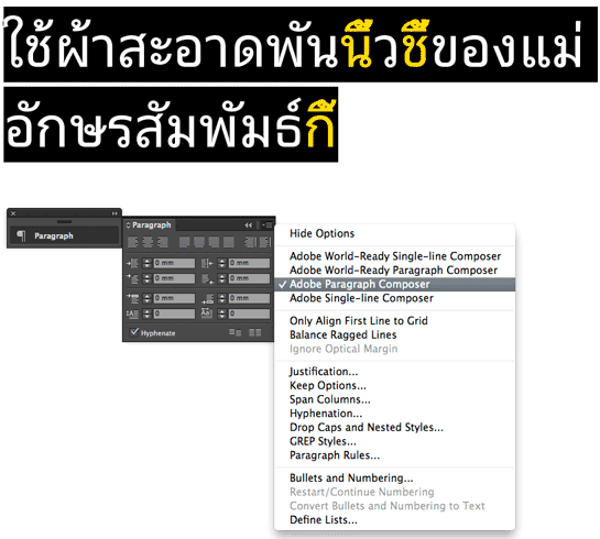
Adobe Paragraph
If the text is set with "Adobe Paragraph Composer", the positioning of the accents does not work fully.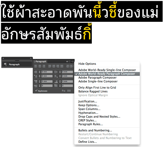
Adobe World Ready Paragraph
If the text is set with "Adobe World Ready Paragraph Composer", the display functions correctly.
Adobe Paragraph
If the text is set with "Adobe Paragraph Composer", the positioning of the accents does not work fully.
Adobe World Ready Paragraph
If the text is set with "Adobe World Ready Paragraph Composer", the display functions correctly.