Magma II
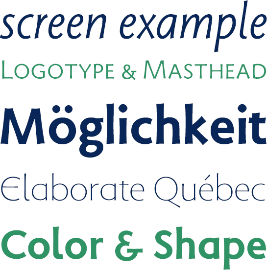
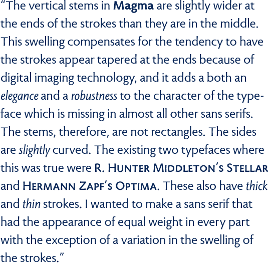
 Sumner Stone started to develop Magma with the goal of drawing a legible sans serif that looks good not only in headlines, but in continuous text as well. Like his role models, Stellar by Robert Hunter Middleton, Optima by Hermann Zapf, and Syntax by Hans Eduard Meier, he reaches back to the Renaissance Antiqua for the basic shape of the letters. The friendly and lively character of the font, provided by slight variations in the weights, is supported by stems that taper towards the middle. Moreover, this trick lends Magma an elegant flair in the large font sizes. In the smaller sizes – particularly on digital output devices – it prevents the impression of tapering to the ends of stems. The tapered and slightly grooved ends support the dynamic character of Magma, bringing to mind the nib of a fountain pen. The shape of the dots is also interesting in this context: they represent a mixture of a rectangle standing on end and an oval.
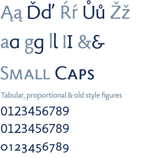
With Magma II, the refined version of Magma with an expanded character set, you not only get many new accents for the Eastern European language area, but also have some new alternative letters. The lower-case “a” is also included in the closed form, as well as a one-eyed version of the “g” and an “l” with a round foot. The upper-case “I” has an alternative with a crossbar, and an open version of the commercial “&” is included. Small caps and various number sets round out the offer.
Designer Interview
-
Sumner Stone
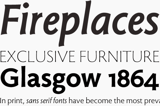
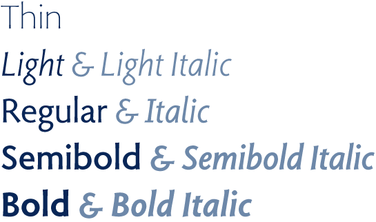
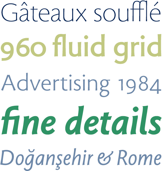 Magma II is available in five finely graded weights, from Thin to Bold. The four strong styles have a genuine italic, strongly based on an Antiqua. The much narrower letters get a round and dynamic shape; slightly truncated ends emphasize the handwritten character.
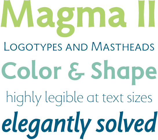
 Magma II is designed to be and is applicable as a universal genius. The lively and interesting details lend the font a very special charisma in headlines or in advertising. The sophisticated and well-balanced design ensures that you can use Magma II easily for long texts, and guarantees perfect readability in electronic display media.
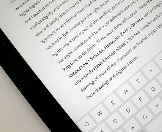 The expanded character set not only gives you fresh potential for international projects; the new alternative characters offer you more room to play when it comes to logo and title design. And for added effect, you can combine Magma II with other fitting fonts, like Munc.
