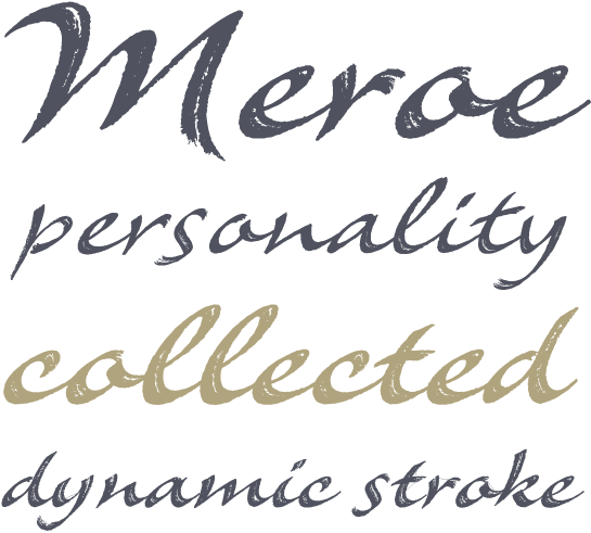
The German designer, Peter Becker drew the first letters of the Meroe as a logo in the course of one of his very many packaging design projects. When further letters were added for a few lines of text, he had the idea of expanding the design to a complete typeface.
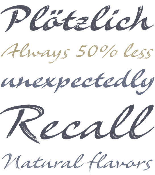
Even although there are currently numerous letters available, there is still a long way to go to the completed font. The composition samples showed particularly quickly that letters, which are perfectly in harmony in size and space for a logo, cannot be arbitrarily combined with each other. But this is exactly what is required of a typeface and so Becker drafted countless designs, before he discovered the forms to give a balanced typeface.
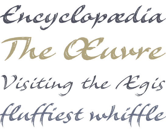
Eventually the Meroe was based on Becker’s handwriting, written with an almost dried-out calligraphy pen on untreated paper. This was the origin of the irregular outline, the characteristic, open forms within the strokes and partly strongly frayed line caps. Dynamic, slanted letters of a rapidly written script give the Meroe its vibrant character, which is supported by some widely extended line caps.
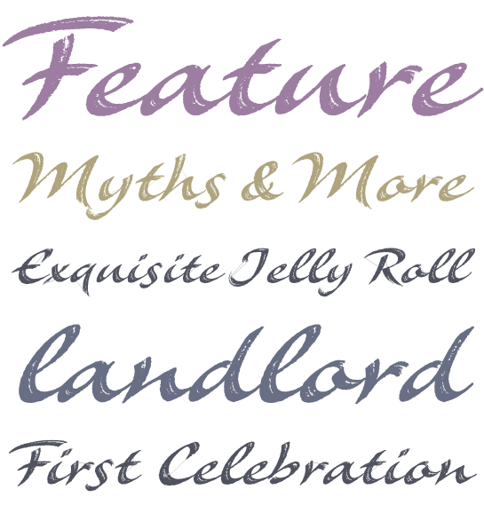
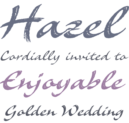
Meroe is available in two font styles, Regular and Bold. However the Meroe Bold is not just a bolder variant; in comparison with the rather more condensed Regular, the letters are completely new, drawn with a thicker pen. In this way the character of the font is indeed preserved, however the letters differ from each other in numerous details of the stroke direction and in the open forms within the lines.
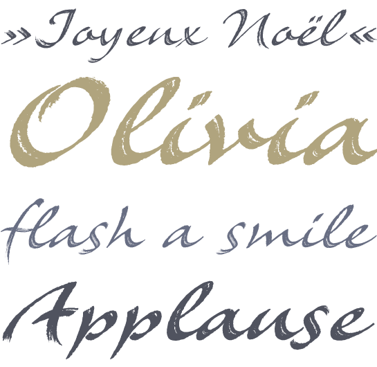
Meroe is a warm, calligraphic script with a very dynamic touch. The many little details of the rugged stroke direction show to advantage in large font sizes. Nonetheless, Meroe is also very readable in small sizes. The font feels at home everywhere, where a personal note is required, as for example, in invitations and greetings cards , but of course also in packaging design.

 The German designer, Peter Becker drew the first letters of the Meroe as a logo in the course of one of his very many packaging design projects. When further letters were added for a few lines of text, he had the idea of expanding the design to a complete typeface.
 Even although there are currently numerous letters available, there is still a long way to go to the completed font. The composition samples showed particularly quickly that letters, which are perfectly in harmony in size and space for a logo, cannot be arbitrarily combined with each other. But this is exactly what is required of a typeface and so Becker drafted countless designs, before he discovered the forms to give a balanced typeface.
 Eventually the Meroe was based on Becker’s handwriting, written with an almost dried-out calligraphy pen on untreated paper. This was the origin of the irregular outline, the characteristic, open forms within the strokes and partly strongly frayed line caps. Dynamic, slanted letters of a rapidly written script give the Meroe its vibrant character, which is supported by some widely extended line caps.
 Meroe is available in two font styles, Regular and Bold. However the Meroe Bold is not just a bolder variant; in comparison with the rather more condensed Regular, the letters are completely new, drawn with a thicker pen. In this way the character of the font is indeed preserved, however the letters differ from each other in numerous details of the stroke direction and in the open forms within the lines.
 Meroe is a warm, calligraphic script with a very dynamic touch. The many little details of the rugged stroke direction show to advantage in large font sizes. Nonetheless, Meroe is also very readable in small sizes. The font feels at home everywhere, where a personal note is required, as for example, in invitations and greetings cards , but of course also in packaging design.
