Agilita
Agilita™ is a new humanistic sanserif typeface designed by Jürgen Weltin. The mulitilingual OpenType font family has rather classical proportions, to give it more distinct word shapes through clear descenders and ascenders.
This new face has a dynamic, yet strong and very functional appearance with a fine but clear emphasis on the horizontals.
The classical approach of Agilita makes it a versatile typeface for largescale textsetting but it can also be used in complex information design projects, and orientation
systems, for example.
Font Weights
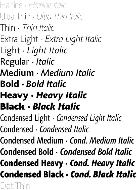
Agilita consists of 33 variants (10 different weights and six additional versions of Condensed variants with the corresponding italics and the weight Dot Thin).
First Drawings
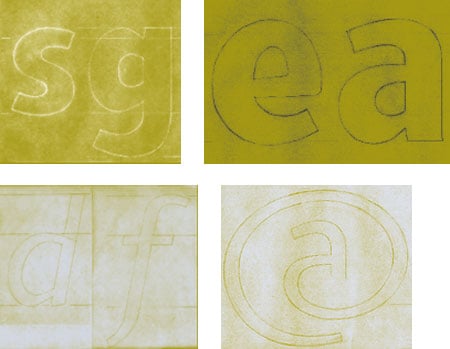
The first drawings from Jürgen Weltin to be used for digitizing Agilita™ began early in 2000.
A Typeface Family System
Agilita is a type family system with a wide range of weights covering the use for display and headline setting as well as for largescale textsetting. Corresponding condensed weights are suitable where horizontal space is rare as in narrow columns and tables, for example.
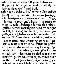
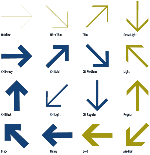
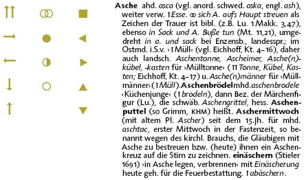
Special Arrows and Signs
Agilita comes with special arrows and signs which can be used in dictionaries; like arrows for lemmata, signs for cross references, idioms or colloquial language.
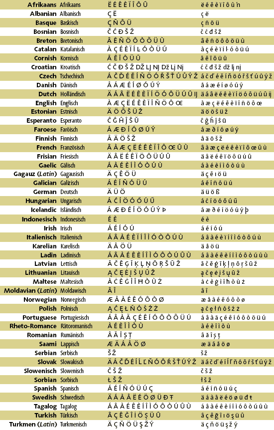
OpenType Support
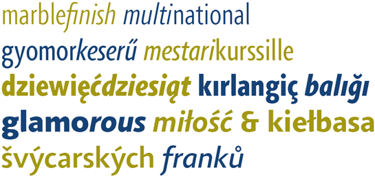
The Agilita OpenType font family supports about 48 languages represented through the Latin alphabet.
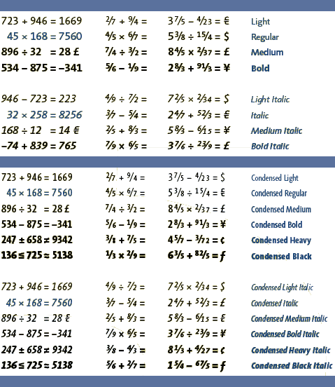
Tabular Figures
The tabular figures in Light, Regular, Medium and Bold versions share the same widths and are compatible with their Italic counterparts. Compatability is also given between Hairline/Ultra Thin, Thin/Extra Light and Heavy/Black. In the Condensed versions all of the tabular figures take up the same space.
Two Sets of Arrows
There are two sets of arrows for the use in orientation systems available for all weights.