Xenois Super, Soft, Slab
New styles put the finishing touches to the Xenois:
Super, Soft und Slab
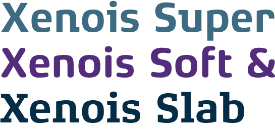
Xenois Sans, Serif and Semi made their appearance a few months ago. Now Erik Faulhaber has completed the Xenois super family with Soft, Slab and Super.
With the styles now available the Xenois super family is complete and ready for all eventualities. The three new styles are also based on the successful, greatly reduced construction principle of the Xenois and therefore do not just integrate perfectly into the existing family, but at the same time expand the possibilities for its use. With its clearly differentiated styles the Xenois universe puts into your hand the tool you need as a designer to deal with very varied situations and to enthuse your customers with the typography which is absolutely suited to their needs.
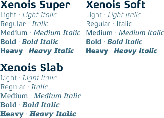
A unified basic form which consistently pares everything back to the essential – this is the design principle behind the new Xenois Super, Soft and Slab styles. Thus, the descenders on the uppercase Q and the uppercase J have been abandoned, while the x-height and the descenders and ascenders have been standardised.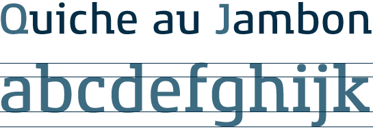
Erik Faulhaber has systematically created six different font styles, in which the stroke weights are in harmony with each of the individual styles. The versatile font, which has resulted from this, makes possible a huge variety of combinations and design possibilities.
Like the styles in Xenois Sans, Serif and Semi, the members of the Xenois super family also have matching italic fonts for all the styles. There is also a variety of figure sets for proportional and table fonts. The new Xenois styles’ pan-European stock of characters covers both the Western European languages and many Central European languages. Several ligatures, mathematical characters suitable for tables and arrow symbols round off the comprehensive range of characters.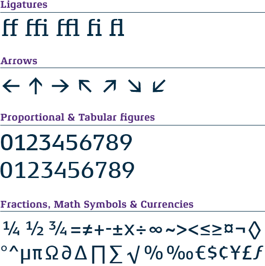
The weights Regular, Medium and Bold of Xenois Soft meet the requirements of DIN 1450, the new German standard that sets out guidelines for the appearance of texts to ensure these are legible for everyone. As a result, Xenois Soft can also be used on signage systems in public areas and can even be employed in situations in which legibility might otherwise be problematic. For example, the lowercase “l” and the numeral “0” of Xenois Soft have been designed in such a way that they retain their characteristic forms even in poor conditions and cannot be confused with other glyphs of similar appearance.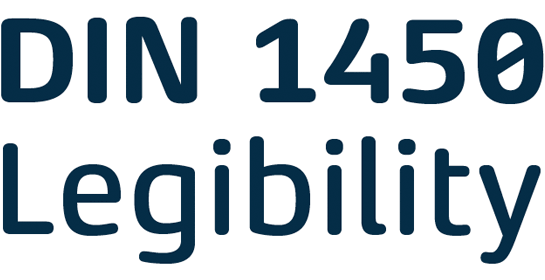


A unified basic form which consistently pares everything back to the essential – this is the design principle behind the new Xenois Super, Soft and Slab styles. Thus, the descenders on the uppercase Q and the uppercase J have been abandoned, while the x-height and the descenders and ascenders have been standardised.

Erik Faulhaber has systematically created six different font styles, in which the stroke weights are in harmony with each of the individual styles. The versatile font, which has resulted from this, makes possible a huge variety of combinations and design possibilities.

Like the styles in Xenois Sans, Serif and Semi, the members of the Xenois super family also have matching italic fonts for all the styles. There is also a variety of figure sets for proportional and table fonts. The new Xenois styles’ pan-European stock of characters covers both the Western European languages and many Central European languages. Several ligatures, mathematical characters suitable for tables and arrow symbols round off the comprehensive range of characters.

Xenois Super: an elegant sans serif with extensive contrasts
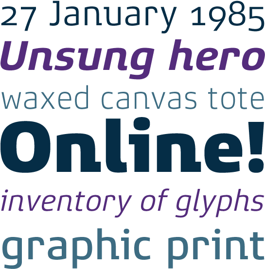
The forms of the Xenois Super form a bridge between Xenois Sans and Xenois Slab fonts. Depending on the way you look at it, it is a sans enhanced by a few slab serifs or a slab with a reduced number of serifs. Very sparingly used, the serifs, which can be seen on only a few letters, acquire the character of strong strokes and lend the Super a very personal touch. The Xenois Super figures assume a special role; in contrast to the other styles, they are designed as mediaeval figures.
Xenois Soft: a sans serif with rounded corners, which can be used for DIN 1450-compliant applications and signage systems
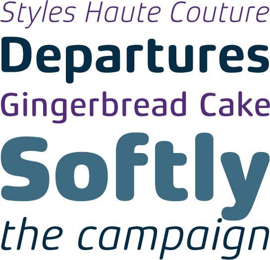
Rounded terminals give Xenois Soft a slightly matter-of-fact, yet still warm and friendly character. The font is especially justified for the use of signage systems, but could also be very effective in captions.The weights Regular, Medium and Bold of Xenois Soft meet the requirements of DIN 1450, the new German standard that sets out guidelines for the appearance of texts to ensure these are legible for everyone. As a result, Xenois Soft can also be used on signage systems in public areas and can even be employed in situations in which legibility might otherwise be problematic. For example, the lowercase “l” and the numeral “0” of Xenois Soft have been designed in such a way that they retain their characteristic forms even in poor conditions and cannot be confused with other glyphs of similar appearance.


Xenois Slab: a classic variant with marked contrasts and delicate serifs
The character of the Xenois Slab is determined by very strong, quadrate, very slightly conical serifs and a relatively slight contrast in stroke weight, comparable with the Xenois Sans. The absence of spurs in this font variant is particularly noticeable and lends the Xenois Slab its unmistakable character, with its own inherent tension. Its strong forms are suitable not only for captions, but also cut a fine figure within the text.