Cape Arcona
The Cape Arcona Foundry
Stefan Claudius and Thomas Schostok, both German, put amusement in first place when it comes to font design. In 2002, they established the font label Cape Arcona©, whose home is the coast of the fantasy state of Arcona where the two have appointed themselves president and king. Other than one might expect, Claudius and Schostok do not just design fun fonts: the Cape Arcona output includes text, script and pictogram typefaces.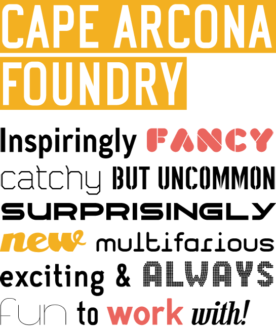 We profile a selection of their typefaces below.
CA Aircona
We profile a selection of their typefaces below.
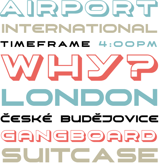
CA AirconaThis is a font that could well appear on the side of aircraft – perhaps on the planes of the national airline of Arcona. There are alternative forms of several letters and a second cut that has a 3D effect.
CA Aires
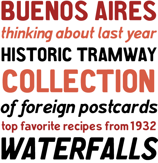
The majuscules of this font were inspired by a 1930s postcard. The lowercase letters are designed in the same, highly individual style adopted by Claudius.
CA Cula
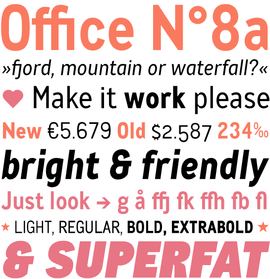
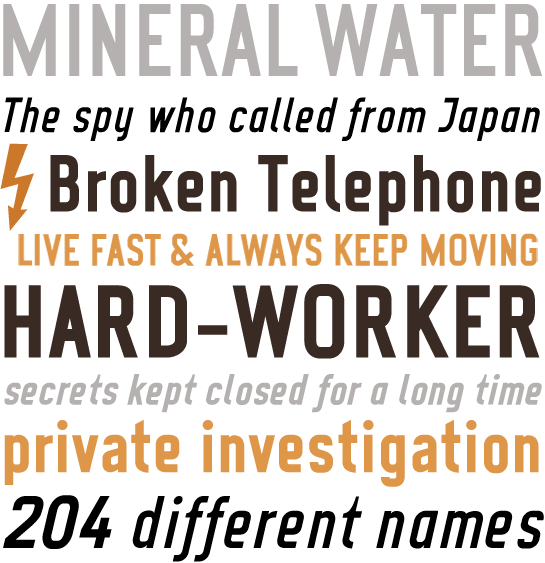
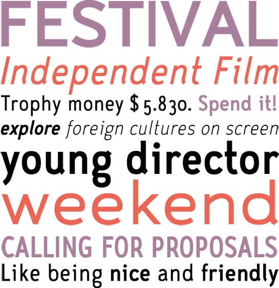
For Claudius and Schostock, CA Cula continues the tradition of technical DIN Grotesque fonts. The “ink traps”, particularly apparent in display sizes, are characteristic of Cula. The font is available in four weights, for each of which corresponding italics are available.
CA Emeralda Script
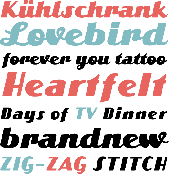
This retrofont was inspired by a 1950s advertisement. CA Emeralda Script is available both in italic and script versions.
CA Geheimagent
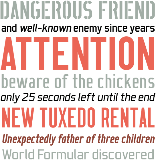
Not really a text font, but also not a headline font, this austere, stencil-like “secret agent” typeface is available in two weights with corresponding italic cuts.
CA No Dr.
Another Grotesque with technical overtones – for Thomas Schostok, No Dr. has all the diabolical characteristics of the (almost) namesake villain in the James Bond film, the poster of which provided the inspiration. There are two different widths and two different weights of this typeface.
CA Play
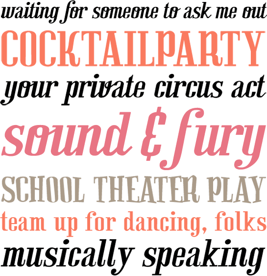
The five different cuts of this retrofont with their very different and yet corresponding letter forms invite users to play with them. Why not give it a try yourself?
CA Prologue
Stefan Claudius claims this is the sort of typeface that would be used by a postmodern typewriter. This stencil font is available in three widths.
CA Sensuell
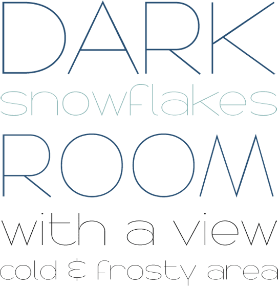
Hairline-thin, this idiosyncratic but refined Grotesque is at its very best in larger sizes.
CA Viva Las Vegas
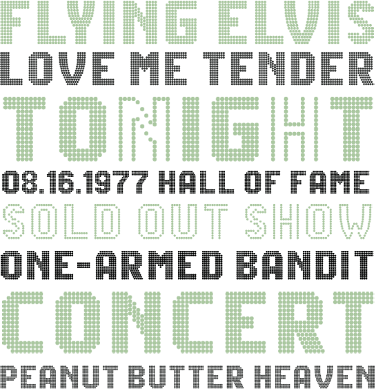
This font has been designed to simulate the effect of a neon sign, whereby the “Night” version is for “lights on” and the “Day” version is for “lights off”.
CA Wolkenfluff
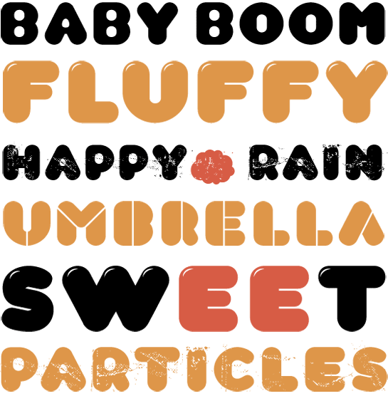
There are various available styles of this fat, balloon-like font. Gloss highlights can be added to the Regular version, while there are also Stencil and “Trash” versions.
CA Zaracusa
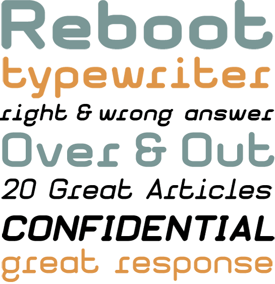
Originally designed as a CI font, this interesting although unassuming Grotesque family is particularly extensive. With 24 versions in different widths and weights, it has many potential applications.
CA Monodon
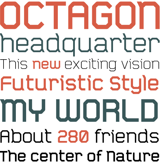
This stencil font consisting solely of straight lines is the work of Donald Beekman. Cape Arcona stresses that there are five different weights that can be used to introduce variety into texts, so that this font is anything other than monotonous.
*On their website, Claudius and Schostock stress that the wonderful world of Arcona has nothing to do with the luxury liner “Cap Arcona”. This ship, named for Cape Arcona on the island of Rügen, was used by the Nazis to transport prisoners of war towards the end of the Second World War. The liner was attacked by the Royal-Air-Force and the German guards refused to allow the prisoners to leave the ship, so that many hundreds died as a result.