Massif
Individual and very lively, with its own strong character:
the Massif font by Steve Matteson.
Steve Matteson is an experienced designer who above all has been drawing individual fonts for his customers for many years. He created the sans serif Massif as a project of his own, and it was published in 2011 after several years of work.
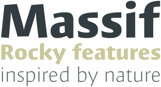
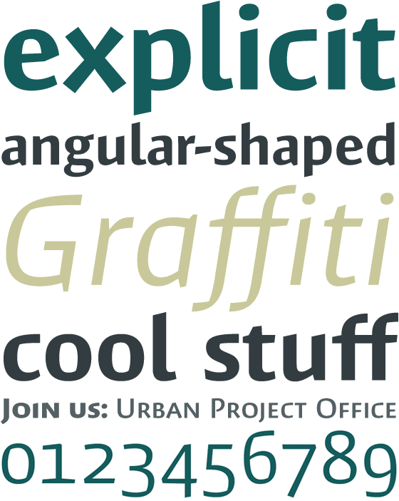
The inspiration behind the shapes of Massif™ typeface family is a striking mountain in the Sierra Nevada. The brow of the so-called Half Dome drops off steeply on one side, while the other side is smoother and rounded. Steve Matteson transfers this contrast between rounding and straight lines into the letters of Massif. While the external shapes take the form of a curve, the internal shapes are suggestive of an angle. This is not only slightly reminiscent of the use of shape in Broken fonts, but also emphasizes the contrast between the weights.
“My goal was to embody, in Massif’s two-dimensional letterforms, the angular tension and smooth curvature characteristic of the rugged terrain of Yosemite National Park’s Half Dome, which was formed by eons of glacial and tectonic activity,” is how Matteson describes the task he set himself.
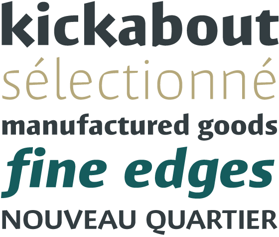
As well as the striking basic shape, the character of Massif is determined by slanting and to some extent conically tapered line ends. The diagonals in k, w, x and y finish with a right angle. Small individual features of some of the letters underline the individual appearance of Massif. Thus the “e” has a slanting curve, the lower case “l” is rounded at the bottom, the upper case “P” has an open curve and the cross strokes in the upper case “E” and “F” are slightly conical.
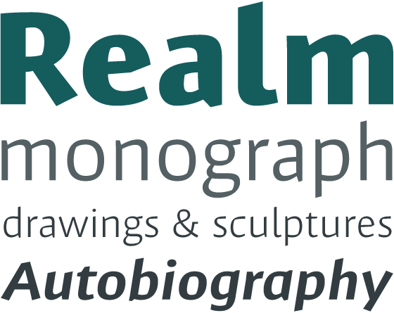
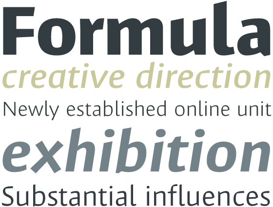
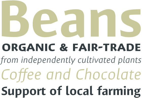
The generous options with six different weights light, semilight, regular, semibold, bold and extrabold open up a wide range of options for using Massif. In the italic versions, which have been carefully designed to be narrower, the changed letter shapes underscore Massif’s position as a quality font. The “a” changes to a closed shape and the “g” to a single bowl. Letters such as the “f” are given a descender. In addition, small caps and lower case numerals are available in all versions of Massif via OpenType features.
The font’s language set meets nearly everyone’s wishes, and in the Pro version Massif supports most Central European and many Eastern European languages. The character set in Massif is rounded off by several graphic elements and the standard ligatures.
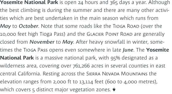
Massif is a sans serif font with a strong character if its own, which can also display its great individuality in small font sizes. Modern and lively elements on the one hand compete with a slightly historical flair on the other. Massif looks good not just in titles, but everywhere where it is great individuality that matters. And thanks to its large x-height, the font is also easy to read in small sizes and therefore can also be used in blocks of text.
