Discover legacy content from linotype.com, preserved for your reference.
Stempel Elan
Stempel Elan – Revival and Rediscovery
by Frank Grießhammer, the designer of Stempel Elan
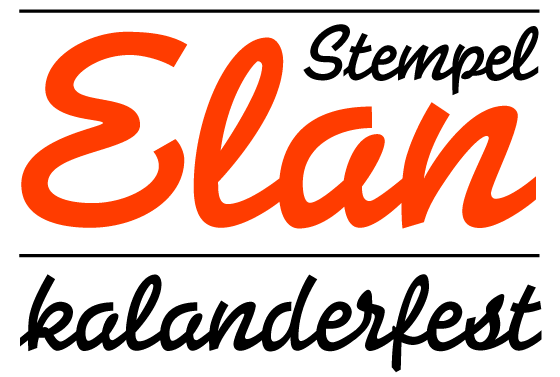
If you ever visit the Klingspor Museum in Offenbach, be sure to take a look inside their library. The type specimen collection is impressive, and includes one-of-a-kind examples. Although the design of these specimen and the typefaces in them is unmistakably 20th century, the effect that these pages have is still fresh and appealing. At the same time, I cannot think but how terrible it is to see how many excellent typefaces never managed the jump into the digital age. Republishing these classics must have seemed a task that wouldn’t be lucrative enough, or would require too much work. A number of gems slumber in the archives, waiting for their opportunity to be reawakened.
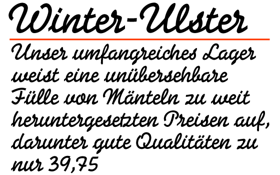 |
Take for instance the “Elan” typeface, designed by Hans Möhring in 1937 for the D. Stempel AG foundry in Frankfurt am Main. According to its original specimen text, the typeface "is an especially good display companion for all Grotesks, but also for Memphis (an Egyptienne) and other Serif typefaces." In other words, it is suitable for any purpose.
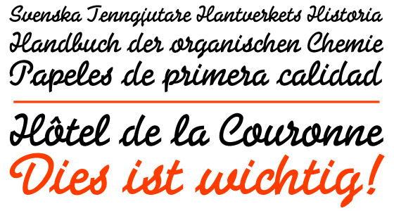 |
Stempel Elan™ imitates a typical lettering style used in 1930s advertising. Its forms appear monolinear, with very low contrast. Again, the original specimen explains, “The uniform stroke and continuous line take the individual letters, which are each full of movement on their own, and line them up into orderly lines of text.” Even though Elan’s appearance is that of another era, it is still an interesting design. Many of its forms cannot be found in other typefaces. A lot of Elan’s design features could be called “typically German,” but not in any negative sense. On the contrary, it is by consciously focusing on specific letterforms that the typeface develops its unmistakable character.
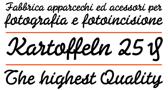
I am fascinated by typefaces that pretend to be something that they are not. In the typeface’s specimen, the authors wrote that text set in Elan looks as if it was handwritten. In reality, it is absurd to devote such an amount of time and energy, as well as technical know-how, to cut a typeface that should just look as if was handwritten. However, the field of script typefaces is so interesting today precisely because the limits of feasibility are not clearly defined. Therefore, new interpretations are possible.
I am fascinated by typefaces that pretend to be something that they are not. In the typeface’s specimen, the authors wrote that text set in Elan looks as if it was handwritten. In reality, it is absurd to devote such an amount of time and energy, as well as technical know-how, to cut a typeface that should just look as if was handwritten. However, the field of script typefaces is so interesting today precisely because the limits of feasibility are not clearly defined. Therefore, new interpretations are possible.
 |
Every time that I see Elan in old printed matter, I am impressed by its nonchalant manner. In my opinion, Elan is an excellent display face for any casual layout, and fits a variety of occasions. For me, it was clear that this typeface must receive a new digital lease on life. Over a period of two years, I developed a new font that, in comparison with the original metal version, includes a much larger character set, and also allows for a number of script refinements via OpenType features.
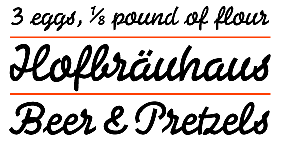 |
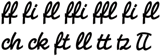
In-strokes for the lowercase letters may be activated via the Contextual Alternates feature. Aside from standard ligatures like fi and fl, a number of extras such as tz or ll are accessible via the Discretionary Ligatures feature. Even the on-the-fly generation of any diagonal fraction is possible, thanks to the Fractions feature.
 |
In the days of metal type, it was impossible link letters together into a solid word images. Because of that technology, small gaps were always visible in the letters’ connections (Take a look at the first image on the next page). This problem may be totally removed in digital fonts, since overlaps are permitted.
The new font contains the typical currency symbols, such as the yen or the euro, but also the “German Penny Sign,” (U+20B0), in order to enable the using of the typeface in a historical setting.
The new font contains the typical currency symbols, such as the yen or the euro, but also the “German Penny Sign,” (U+20B0), in order to enable the using of the typeface in a historical setting.
 |
Last but not least, the typeface has received a new name: Stempel Elan. This reference is to the old D. Stempel AG foundry, which published the original design in 1937. Using the name Stempel Elan also helps to differentiate the design further from ITC Elan, a serif typeface that bears no relation to Hans Möhring’s work. I hope that this revival proves to honor the original designer. Also, I hope that, with its new digital form, this typeface finds many users.
July 2010
Frank Grießhammer
* All text and images from the type specimen “Balzac Bazar Elan Kompakt,” published by D. Stempel AG during the 1930s.
July 2010
Frank Grießhammer
* All text and images from the type specimen “Balzac Bazar Elan Kompakt,” published by D. Stempel AG during the 1930s.
On the next page, you’ll find samples printed with the original metal type version of the Elan typeface.