Francker
Francker from Francker

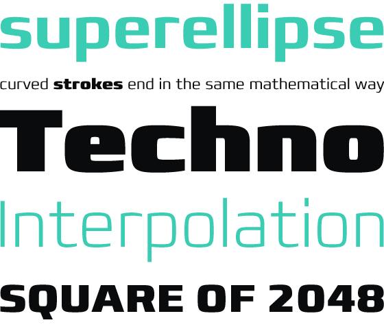
Hailing from Denmark, Anders Francker’s first typeface family, Francker™, is inspired by the ‘superellipse’ or ‘Lamé curve’. Add to that concept a dash of techno and a pinch of high-tech, and you have a recipe for a typeface that feels modern without being too clean or clinical.
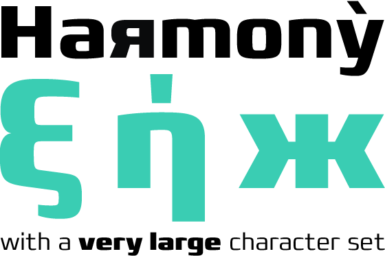
Its broad character set encompasses, in addition to Latin, both Greek and Cyrillic. The contrast between curves and straights lends the design some tension, and while Anders says that Eurostile® was one of his inspirations, it’s certainly not a back-to-the-future cliché. Its finely crafted, tapering terminals lend it a little softness; It’s large x-height and generous forms serve it well in text, though it really comes into its own as a display type, made all the more versatile by its nine weights, from Extra Light through Extra Black.
more ...

