Select this license type when you are developing an app for iOS, Android, or Windows Phone, and you will be embedding the font file in your mobile application's code.
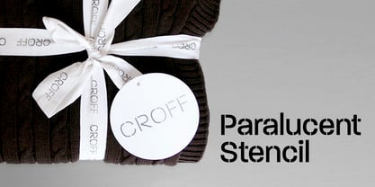
Paralucent
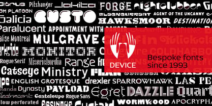
by Device
Individual Styles from $29.00
Complete family of 35 fonts: $735.00

Paralucent Font Family was
designed by
Rian Hughes and
published by
Device. Paralucent contains
35
styles and family package options.
More about this family
- Aa Glyphs
-
Best ValueFamily Packages
- Individual Styles
- Tech Specs
- Licensing
Paralucent Normal Family
14 fontsPer style:
$22.78
Pack of 14 styles:
$319.00
Paralucent Condensed
14 fontsPer style:
$22.78
Pack of 14 styles:
$319.00
Paralucent Essentials
6 fontsPer style:
$26.50
Pack of 6 styles:
$159.00
Paralucent Text Family
4 fontsPer style:
$29.75
Pack of 4 styles:
$119.00
Paralucent Stencil Family
3 fontsPer style:
$26.33
Pack of 3 styles:
$79.00
About Paralucent Font Family
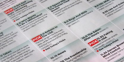
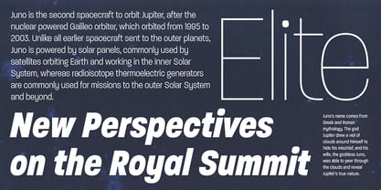
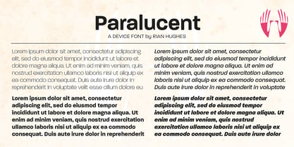
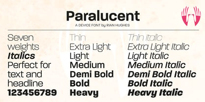
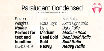
Paralucent is versatile all-purpose modern sans. Available in seven weights, from Thin to Heavy, and in two widths each with corresponding italics, it avoids some of the more eccentric calligraphic quirks of Akzidenz or Helvetica or the cool precision of Univers for an elegant, functional, yet warm design.
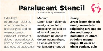
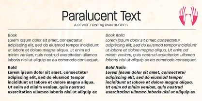
There are two additions to the core 28-weight family: a three-weight stencil set, and a four weight text family. The text weights have been adjusted for use at small point sizes, and feature more open character shapes, looser inter-letter spacing for improved readability, and lining numerals for use in listings and tables.
Several core ideas inform Paralucent’s design. Prime attention has given to the negative space between characters, giving a more even “colour”, especially in text. For example, the J, L and T have shorter arms than comparable sans typefaces, while the M and W are wider. The A has a lower bar, opening up the interior counter. An unusually high lower-case x-height again helps to give a more even colour and improve legibility. Care has been taken to rationalise repeated elements like the tails on lower-case letters, or the Q and the “ear” of the g. Typographic design solutions that are consistent across all these features add more stylistic cohesion.
‘Ink traps’ are exaggerated incisions used to open up a letter's narrower internal angles, which can become clogged with ink, especially in small point sizes. Now largely redundant due to the high quality of modern print, they are still sometimes used as a stylistic quirk or design feature. Now that digital fonts are often reversed or outlined, or enlarged to enormous sizes, these can also lead to unexpected or obtrusive results. Paralucent takes these inevitable digital manipulations into account, and adds optical corrections without resort to ink traps.
The family has been picked up by many UK and US publishers, featuring heavily in magazines like Loaded, Heat and TV Quick, as well as high-end coffee-table photography books and gallery websites.
A perennial Device bestseller.
Designers: Rian Hughes
Publisher: Device
Foundry: Device
Design Owner: Device
MyFonts debut: Nov 17, 2004
Paralucent
About Device
Device Fonts is the font arm of Rian Hughes’ Device studio, operating out of Kew Gardens, London. An early contributor to FontShop’s FontFont range, Device Fonts was launched in 1997 to carry Hughes’ growing library. It has released over 200 original typefaces covering more than 1000 individual weights, including custom designs for clients as diverse as Mac User, 2000AD and The Teenage Mutant Ninja Turtles. Rian studied at the London College of Communication in London before working for an advertising agency, Smash Hits, i-D magazine and a series of record sleeve design companies. Under the studio banner Device, he provides design, custom type and illustration for advertising campaigns, record sleeves, book jackets, graphic novels and television. He has designed posters for Tokyo fashion company Jun Co.’s Yellow Boots chain, the animated on-board safety film for Virgin Airlines, Eurostar’s poster campaign, a collection of Hawaiian shirts, a range of watches for Swatch, the brochure for MTV Europe’s Music Awards, and numerous book jacket illustrations and CD covers. He has designed many logos for DC, Marvel, Valiant, Image and other comic book companies for such titles as Batman, the X-Men, James Bond, The Avengers and Spider-Man. Long connected with the world of comics, Rian Hughes' first graphic novel was ‘The Science Service’ for Belgian publisher Magic Strip. This was followed by ‘Dare’ for IPC’s short-lived ‘Revolver’, an “iconoclastic revamp of the ’50s comic hero Dan Dare”, written by Grant Morrison. His strips from the Galaxy’s Greatest have been collected in ‘Yesterday’s Tomorrows’ (‘Dare’, ‘Really and Truly’ plus others) and ‘Tales from Beyond Science’ (written by Mark Millar, John Smith and Alan McKenzie). More recently he wrote and drew a ‘Batman: Black and White’ tale, contributed to ‘Vertigo: Magenta’, designed the map of the DC Multiverse and was reunited with Morrison for two stories for ‘Heavy Metal’ magazine. He has contributed to numerous international exhibitions, lectured widely both in the UK and internationally, and a one-man show of his work was held in 2003 the Conningsby Gallery, London. A retrospective monograph, “Art, Commercial” was published in 2002, and "Ten Year Itch", a celebration of the first ten years of Device Fonts, was published in 2005. Recent books include "Custom Lettering of the 20s and 30s", and the all-ages wordless graphic novel "I Am A Number", "Soho Dives, Soho Divas" collects his burlesque drawings, and he sets out his memetics manifesto in Cult-Ure: Ideas Can Be Dangerous. A collection of his logo designs, “Logo a Gogo”, was released in 2018 by Korero Press He has a collection of Thunderbirds memorabilia, a fridge full of vodka, and a stack of easy listening albums which he plays very quietly. www.rianhughes.com www.devicefonts.co.ukThe Premium foundry page can be viewed Here.
Read more
Read less
- Choosing a selection results in a full page refresh.