Discover legacy content from linotype.com, preserved for your reference.
Nami

Designed by Adrian Frutiger and Akira Kobayshi, 2006
Nami®, the Japanese word for “wave,” is the latest collaboration between Adrian Frutiger and Linotype’s Type Director, Akira Kobayashi. This typeface family is the most humanist sans serif ever designed by Adrian Frutiger, and it has an interesting twist: lapidar alternates that may be surfed through with the help of OpenType-savvy applications.
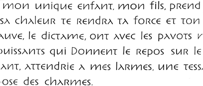
Adrian Frutiger began the design that would blossom into Nami during the 1980s. Although it would not be produced during the 20th century, it was quite forward thinking. The typeface included several seemingly avant garde alternates – “lapidary” versions of common letterforms. Revisiting the project in 2006, Akira Kobayashi reworked the concept into a working family of three typefaces. Each font contains 483 glyphs, including 11 alternates – two extra forms of the lowercase g, as well as new forms for a, e, h, l, m, n, r, t, and u.
 |
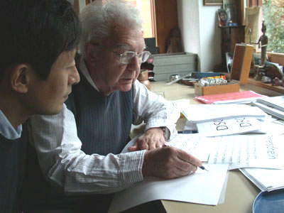
| Adrian Frutiger and Akira Kobayashi discuss the typeface´s development |
 |
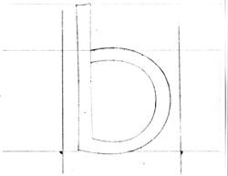
| Sketches from the design phase |
 |
| Early drafts of the lapidar characters |
 |
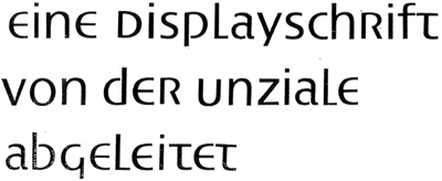
| This sketch illustrates some uncial forms that did not make it into the final version |
Search with the keyword for ‘Frutiger’ to find all fonts in the Linotype Library designed by Adrian Frutiger.
more ...
more ...