Select this license type when you are developing an app for iOS, Android, or Windows Phone, and you will be embedding the font file in your mobile application's code.
Zemestro™
by Monotype
Individual Styles from $29.99
Complete family of 6 fonts: $442.99


Zemestro Font Family was
designed by
Dave Farey and
published by
Monotype. Zemestro contains
6
styles and family package options.
More about this family
- Aa Glyphs
-
Best ValueFamily Packages
- Individual Styles
- Tech Specs
- Licensing
Per style:
$73.83
Pack of 6 styles:
$442.99
Zemestro Complete Family Pack
6 fontsPer style:
$61.66
Pack of 6 styles:
$369.99
Zemestro Complete Family Pack
6 fontsPer style:
$56.33
Pack of 6 styles:
$337.99
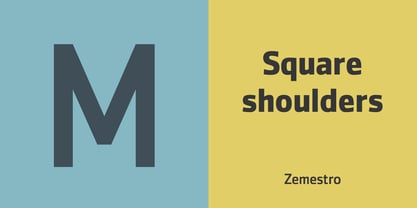
About Zemestro Font Family
Zemestro from 2003 was one of the first of the new “squarish sans-serifs”. Its designer David Farey says: “There’s nothing calligraphic about it, and there are no defining or identifiable single characters – it’s just clean and simply constructed.”
Designers: Dave Farey
Publisher: Monotype
Foundry: Monotype
Design Owner: Monotype
MyFonts debut: Oct 13, 2005
Zemestro™
is a trademark of Monotype Imaging Inc. and may be registered in certain jurisdictions.
About Monotype
The Monotype Library is one of the world’s largest and most comprehensive collection of typefaces, featuring original designs of historical importance and a fresh range of contemporary and fashionable fonts. The Monotype Library includes thousands of timeless classics, hand-crafted revivals and original designs from many of the most innovative type designers and foundries in history. This distinctive, award-winning library of premium fonts provides brands and designers with a broad and reliable selection of typefaces for expressive typography in print and on screen. The Premium Foundry page can be viewed Here.
Read more
Read less
- Choosing a selection results in a full page refresh.