

The new Linotype Finnegan
With this Typeface, Curling Up with a Good Book is Lots of Fun
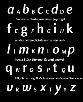
The creation of a new sanserif, monoline font as a text face – this was the starting point for Linotype Finnegan®. Easy and comfortable legibility in large-scale text setting was the foremost concern. Usually, sanserifs are not optimal for reading longer texts because their neutrality and functionality lead quickly to fatigue and disinterest in the reader. This was the exciting challenge for designer Jürgen Weltin: to create a new sanserif typeface that fulfilled this function.
First Drawings
The first sketches emerged in 1993 and strongly recalled block letters drawn with a round-nibbed pen; this led to many redrawings, as well as improvements to the proportions. Even at this early phase, the first figures were digitized to test the typeface’s legibility.
more ... Achieving Optimal Legibility