Select this license type when you are developing an app for iOS, Android, or Windows Phone, and you will be embedding the font file in your mobile application's code.
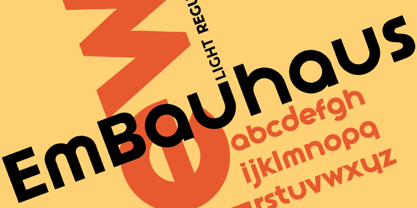
EmBauhaus
by Emboss
Individual Styles from $25.00
Complete family of 3 fonts: $70.00

EmBauhaus Font Family was
designed by
Stephen Boss and
published by
Emboss. EmBauhaus contains
3
styles and family package options.
More about this family
- Aa Glyphs
-
Best ValueFamily Packages
- Individual Styles
- Tech Specs
- Licensing
Per style:
$23.33
Pack of 3 styles:
$70.00
About EmBauhaus Font Family
EmBauhaus is a display typeface, geometric in style, inspired by the face named after the world changing Bauhaus School. To aid readability I rethought the original typeface and closed all of the voids cut out of the strokes. We also modified the upper case to make it a more traditional design. An example of this is the upper case L, where a 90 degree angle was added. This typeface was designed to be used judiciously in a layout, to draw focus to words and headlines, using stark angles, radii and geometry to create visual rhythm and gestalt.
Designers: Stephen Boss
Publisher: Emboss
Foundry: Emboss
Design Owner: Emboss
MyFonts debut: Nov 13, 2012
EmBauhaus

About Emboss
Stephen Boss started Emboss Fonts in the mid nineties. The foundry's aim is to explore conceptual ideas, and convert them into fonts for the world to consume. The foundry's customer base is global, ranging from Iceland to New Zealand and many points in between. Elefont Emboss was the first offering, and it was picked up by Skateboarder Magazine. Other designs developed with an organic progression. Owner Stephen Boss is always amused when he sees one of his typefaces on a poster or taxi cab ad. Emboss Fonts is presently developing some more traditional faces, with a few quirks.
Read more
Read less
- Choosing a selection results in a full page refresh.